Showing posts with label Liam Cobb. Show all posts

August 5, 2019

Letting the Devil In: Nicholas Burman reviews THE PURITAN’S WIFE by Liam Cobb

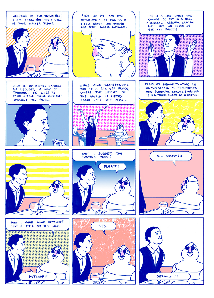
The Puritan’s Wife is something of a thematic and stylistic variation of what one might expect from its author. Liam Cobb is an artist usually associated with pastel shades and surreal modernist settings. In previous works, such as The Fever Closing and The Inspector (previously reviewed on YCE by Ryan Carey), he has taken great pleasure in re-contextualizing recognizable figures such as Bibendum and Mayor McCheese, while taking a sideways glance at contemporary issues. Perhaps unsurprisingly, given its title, The Puritan's Wife is neither warm nor modern. Cobb has put together a tale that encapsulates many of the stereotypes of 17th century New England settlements and settlers, with the obligatory miasma of witchcraft thrown in for good measure.
The opening page is a clear indication of the tone of the rest of the work. The reader is positioned looking up from six feet under; our view is eventually obscured by earth shoveled on top of us. It’s a claustrophobia-forming introduction. The comic remains silent for nearly six more pages, encouraging the reader to focus their energies on the mourners and the austere commune they live in (itself framed by a forest). While the characters may be physically positioned in the great expanse which is, to them, the New World, that sense of claustrophobia from the first page is echoed with a repetitive and precise six-panel layout which dominates much of the book. 
In The Puritan’s Wife, events take place in an isolated community led by John Cotton, the patriarch of this particular flock. The aforementioned funeral was for a child, one of a handful of the God-fearing community’s young who have passed away recently due to illness. From here on in the reader becomes embroiled in a family drama set in the context of a small-minded cult, in which subsequent deaths make members of the commune suspicious that black magic is at play. It all concludes in a suitably dramatic and somewhat biblical manner. Cobb keeps the plot moving along with enough pace and narrative precision to keep you involved, even as you develop pessimistic premonitions of what’s ahead. 
The story itself isn’t wholly original, but that is part of the appeal of such a tale. Puritan Horror is a subgenre with certain conventions and themes. In a review of M. Night Shyamalan 2004’s film The Village, critic Will Self wrote that “the US owes its character to [...] schismatics - whether Puritans, Amish or Mormons, heading off into the wilderness so that they can live according to their conception of the good, free from the corrupting influences of the parent society.” The dramatization and exploitation of these historical scenarios lay at the heart of Puritan Horror, and The Puritan's Wife is a great example of the category. Consequently, fans of The Crucible or The VVitch will find plenty to enjoy here. And thankfully, the ending, as well as further details about the commune itself, is just ambiguous enough to lend the work an identity which doesn’t feel totally copycat. 
A benefit of genre is that spectators are not expecting to be surprised by the plot (in broad terms, we often know what’s coming), but can instead take pleasure in the style and execution of the work. With his more common dayglo environments on pause for this volume, Cobb seems interested in ensuring that the various textures of his tools are on display in this grayscale work. In terms of style, The Puritan’s Wife seems to be Cobb returning to his self-published 2016 work Green Graves. Pencil and crayon marks are left to represent the dust and dirt of the New England landscape.
As Ellen, a key protagonist and maligned member of the commune, walks into the woods, frenetic oiled chalk marks represent her impressions of the shrubs and underbrush. The sense that the commune’s surrounding ecosystem can be flattened into abstraction reoccurs in the comic’s final moments. These flashes of distortion reinforce the notion that this is a world dictated by subjects whose perspectives sometimes wildly differ from typical representations. These representations of nature are reminiscent of van Gogh’s Tree Roots, in which personal, psychological troubles collide with obscure, natural patterns; both ended up representing the other.
Background details are sparse. Thanks to the modesty of the lives of the inhabitants, there isn’t much to show. Cobb adopts gradients to create a soft binary between above and below. The use of halftone repeatedly creates a distinction between the dark “up there” and the bright “down here” in many panels. This isn’t only appropriate period detail, as the only source of light is from candles and torches, it also creates an ominous atmosphere befitting the plot.
Aside from one splash page and a handful of oversized panels, the page layouts remain in a two by six formula throughout. Within this regimental structure, small motions and hesitant expressions take center stage. This is a story which mostly occurs at the level of intimate gestures in tight, domestic spaces, and The Puritan's Wife beautifully showcases Cobb’s gift of being able to draw a story that relies on non-verbal, interpersonal actions. While being so minimalist with its deployment of typically “action” set pieces, The Puritan's Wife would be best described as an action book, albeit actions of the minutest type.
As many of the face-to-face encounters take place indoors, the characters are often surrounded by bare, wood walls. Rather than ensure through digital processes that the patterns of these backgrounds are coherent for each repeated shot, Cobb has instead allowed his free-flowing hand to imagine these patterns anew each time. This gives the somewhat magical realist impression that the characters’ surroundings are in constant flux and that there is a slippery, psychedelic quality to the commune. This also ties in nicely with the impressionistic flourish to the representation of nature and the forest discussed above. It seems that no matter how much the religious mind attempts to give order to the world, the messiness of nature will, much like the devil, enter the home and bring chaos with it regardless.
The Puritan's Wife is published by the UK’s Otto Press, a quality outlet for a range of artists and experiments based in London. Imperfections in the booklet, such as the fact that the width of each sheet doesn’t quite match, and that art regularly bleeds into the margins and over gutters, seem purposeful. They’re nice aesthetic touches for a work that thankfully largely avoids overbearing and distracting design quirks such as a “ye olde Englishe” font.
Cobb has made his name by sampling cultural icons and reappropriating classic storylines (his long-form work The Prince was a reappraisal of the Frog Prince fairytale). In his imagining of Cotton’s commune, Cobb encapsulates society’s ideas of the isolated and superstitious community, in which the hatred of women is never far from materializing and escape seems impossible, thanks to the mental prison bars as much as any physical barriers. In the exterior scenes, it is clear the characters are never far from the impenetrable silhouette of the trees, and you imagine this acting as an invisible wall. The final sequence suggests that the outside world will swallow you whole, that nature will overwhelm you. The reader is left wondering just how long the community can last before the roots and the whims of the wider world will overcome it, too.
----------------------------------------------------
Nicholas Burman is currently based in Amsterdam, from where he writes about comics, experimental music, ambient artistic practices, and DIY culture for The Comics Journal, MusicMap, and Amsterdam Alternative, among others. You can find his portfolio at: https://nicholascburman.com/

April 1, 2019

Check, Please: Ryan Carey reviews THE INSPECTOR by Liam Cobb

Confession time right at the outset: I actively despise what's generally known as "foodie culture." Mind you, I absolutely appreciate the fact that there is a real artistry to good cooking and that restaurants which practice things like the so-called "farm to table" philosophy are certainly going about their business more ethically than, say, McDonald's is, but let's be honest: every goddamn chef thinks he or she (and it's far too frequently a "he" --- a major problem with the restaurant industry is the male domination of, and the resultant culture of misogyny inherent in, most kitchens) is at the very least a local, if not a national, celebrity; menus have become pretentious, ego-driven, and hideously expensive; wait staff act like they're the stage performers a good chunk of them wish they were --- the whole experience of eating out has become a nauseatingly garish production.

Which, I suppose, is fine for dinner theater, but for a weeknight out with your significant other? No thanks, I'll stick with a burger and a beer at the corner tavern or tacos at the neighborhood Mexican joint. I never want to be seen in a place full of people with their heads so far up their asses that they have the unmitigated gall to critique food on such disgustingly frivolous grounds as its "presentation" and "flavor symphony" while a good half of the world is literally starving to death. There's something not just tone-deaf, but seriously sick about all of this wretched excess.

Liam Cobb gets this --- or, at least, I assume he does. Anyone who's read his 2018 Retrofit/Big Planet-published graphic novel, The Prince, can tell you that misdirection, ambiguity, and maybe even a kind of casually callous amorality are prominent features in his work, and these are all present and accounted for in the tone and tenor of his latest work, the short-form The Inspector, released at the very tail end of last year by Breakdown Press. The target of Cobb’s satire (or maybe we can just shorten that to his ire) herein is obvious enough --- but he also seems to offer no real alternative to the gluttony he's skewering, nor even any particular reason to do anything other than go along with its flow.
Which, fair enough, may not really be his job, and a "we're fucked no matter what" attitude can make for something of a conceptually exciting reading experience in and of itself. I don't particularly need my hand held through a comic, and I am perfectly capable of forming my own opinions along the way and conclusions at the finish, but it would be less than honest to say that this story --- which focuses on a careless, thoughtless, Michelin Travel Guide restaurant critic who's well and truly an embodiment of the company's famously weird mascot --- wasn't tinged with a strong undercurrent of resignation bordering on nihilism. If that's cool with you, then you're gonna get plenty of food for thought, as well as a generous serving of belly-laughs (some in spite of yourself) from this comic. If not? You're in for not so much a disagreeable time as an empty, maybe even a pointless, one.

If all of this sounds eerily reminiscent of the pros and cons offered up over the years in regards to existentialism, that's no accident: Cobb's cartooning oeuvre seems to echo the “everything is what it is and even if it were some other way it wouldn’t really matter” outlook of Camus or Sartre more than it does, say, Crumb or Kirby, but there's a sharp wit at its core that steers it well clear of the bleakness of a Ware or a Clowes. In short, he's managed --- and in a fairly brief period of time at that --- to establish an authorial voice entirely his own, one that's equal parts alluring and alienating, realistic and absurd. Reading his comics is challenging, but in no way off-putting --- yet there's an observational quality to them, a detachment that may not go so far as to push you away, but doesn't exactly work overtime to draw you in, either.
There is, for instance, no real plot "progression" in The Inspector until the very end --- our Michelin Man simply goes from town to town, eats ludicrously grandiose dishes prepared by pathetically self-important chefs, and acts every bit as self-satisfied (not to mention self-indulgent) as the self-appointed “superstars” preparing and serving his food. At the last second he learns the disturbing secret behind some "mystery meat" he's about to consume, and then ends up relaxing on a tropical island with a beautiful woman. He may have stumbled onto a scandal that serves the restaurant industry a well-deserved comeuppance, but he's still leading as charmed a life as ever, more by dint of dumb luck than anything else. Maybe Rod Stewart was right, after all --- and that's the first and last time you'll ever hear me say that.

This balancing act of the droll with the intentionally bizarre carries over into the artwork as well, with Cobb's austere and economically-delineated illustrations here counter-balanced with garish riso-printed pastels that catch the eye but almost seem chosen to deliberately conflict with the workaday simplicity of so much of the linework. It's effective, don't get me wrong --- as is the juxtaposition of jam-packed, tight grids with sprawling, double-page "splashes" --- but it's a study in contrasts designed to jar every bit as much as the disparately-paced narrative, which essentially runs in place until it hurries up to the finish line.
All of which leads, more than likely entirely by design on Cobb's part, to the ultimate irony --- and as blindingly obvious as it is for me to describe it as such, it's a little bit of a delicious one. Much like the exercises in conspicuous consumption it mercilessly and deservedly lampoons, The Inspector works because of the combination and interplay of its ingredients. It may not make for the most delicious "meal" you've ever tasted, but it's unquestionably a memorable one, and chances are you'll come back for seconds, as well as feel suitably compelled to see what the chef who crafted it comes up with next.
-------------------------------------------------------------------------------------------------

Ryan Carey lives and works in Minneapolis, Minnesota. He writes about comics for Daily Grindhouse, Graphic Policy, and at his own blog. He also maintains a long-running film review blog, Trash Film Guru.

December 11, 2018

BOOKS WE LIKED 2018: Ryan Carey, Philippe LeBlanc, Steve Morris, and Austin Lanari

It’s the most wonderful time of the year. That’s right -- it’s BEST OF season when comic sites large and small churn out their lists, anointing subjective BESTS and, thereby, relegating thousands upon thousands of unlisted comics to the long box of Misfit Toys.

We here at Your Chicken Enemy are uncomfortable with these implications of creating BEST OF lists. Instead, we focus on celebrating ALL that is good in small press/self-published comics. Our site is built on an appreciation for diversity, admiration of artists, respect for the craft, and, of course, sandwiches.  

So, in lieu of the traditional BEST OF list, Publisher and EiC of YCE, Daniel Elkin, has gathered his flock of (Chicken) Enemies and asked them for their contributions to Your Chicken Enemy’s inaugural
Today’s BOOKS WE LIKED 2018 features books liked by Ryan Carey, Philippe LeBlanc, Steve Morris, and Austin Lanari.

Make sure to check out Monday's Favorites from Rob CloughKim JoohaAlex Hoffman, and Keith Silva.

Ryan Carey:
The Lie And How We Told It 
by Tommi Parrish
Published by Fantagraphics Books
Available HERE

I’m not sure how Tommi Parrish consistently finds new and frankly unforeseen ways to traverse a landscape made up entirely of the raw nerves of human interpersonal relationships, let alone to do it so subtly, but this examination of just a couple of hours in the lives of two estranged friends after an accidental meeting showcases a cartoonist at the very height of their powers: painfully understated to the point where much is un-stated, the strain between them is nevertheless palpable in the extreme, and the amorphous physicality of each person’s body that has long been a staple of Parrish’s painted comics here serves to underscore the fluid nature of those characters’ sexuality, perspectives, even identities. We are who we are, sure --- but who, exactly, is that?

The metafictional “illustrated short story” that runs concurrently with the main narrative teases out at first, later amplifies, most of the themes inherent in the act of “revelation through conversation” the pair of principal players is engaged in, but again is confident enough in itself to do so obliquely and trust readers’ intelligence rather than throw numerous parallels into stark relief in too obvious a fashion. This is supremely rich, detailed, multi-layered storytelling that goes about achieving all its goals in a methodical, yet undeniably organic and expressive, fashion and literally subsumes you not so much underneath, but within, its inexorable flow. That whole “future of comics” thing we’ve all been hearing about for so long? It’s here, it’s now, it’s this cartoonist --- it’s this book.


Grip Vol. 1 
by Lale Westvind 
Available HERE

An imaginary “super-hero” used as a vehicle to comment on the real-life heroics of working women (particularly working women in the blue-collar trades) may seem a bit obvious on paper, but here’s the thing: until Lale Westvind came along, no one actually had thought of it! That makes this a long-overdue comics narrative, to be sure, but Westvind makes up for the lost time ratcheted up by her forebears by going at this largely-wordless graphic novel with as much non-stop gusto as her always-in-motion central character, who lends a helping whirlwind hand to her sisters in the 9-to-5 world while building toward a climactic showdown with a major adversary out to stop not just her, but womankind as a whole by proxy. Yeah, shit gets heavy --- but never doubt for any less than a second that this is ultimately and obviously a celebratory work, it’s four riso-printed colors straight-up pulling you into an undeniable maelstrom of activity with the same verve and enthusiasm as the book’s arresting line art and intuitively-laid-out page structures.

The word I’m grasping for here is literate: this is one of those books so brimming over with confidence and so perfect in its execution that you could hand it to a person entirely unfamiliar with the comics medium and within a page or two, they’d be absolutely transfixed --- as will you be when (not if) you read it. An absolute fucking tsunami of intent the likes of which we’re fortunate to get maybe once or twice in a decade.


Qoberious Vol. 1 
by D.R.T.
Available HERE

 Some comics reveal previously-hidden depths upon successive re-readings, but the debut graphic novel from the mysterious (to say nothing of pseudonymous) D.R.T. is something else altogether: a comic that is an entirely different top-to-bottom reading experience each time. Certain ideas are ever-present, of course --- physical bondage, alienation from the natural world, alienation from others, alienation from the self --- but how and even if they coalesce into something resembling the outlines of a thematic whole? That’s a different process every time you open the cover. 


D.R.T.’s world is not our own --- a washed-out “animation cel” color palette layered atop “cartoony” imagery laden with quasi-mystical geometric symbols, a vaguely jungle-like environment, life forms that resemble some type of human-sheep hybrid --- and yet it also clearly is, the undiluted feelings it elicits coming from places long-buried, perhaps even thought impenetrable, and in no way easy to classify, clarify, or even describe. Everything here is entirely new, entirely unforeseen, entirely unexpected, in many ways entirely unfathomable --- and that’s as true your 20th time through this physically- slim-but-conceptually-dense book as it was the first. An experience like no other not just in the comics medium, but in any, this is the most unique, most compelling, most wholly original work of the year, perhaps of the last several.

Philippe LeBlanc:


Prism Stalker
by Sloane Leong, Darius Ou, Ariana MAher 
Published by Image Comics
Available HERE

I believe good science fiction is able to ask difficult questions about human nature, about behavior and about how we experience life. When I began reading Sloane Leong’s masterful series Prism Stalker, I was struck by the bold, bright and flashy colors, by the way Leong manages to make the world her characters inhabit feel truly alien. It’s the strength of her story that keeps me going back to this title as one of the best comics of the year. The basic story is essentially that Vep, a refugee from a devastated planet, is recruited by a shadowy private organization for her skills to help settlement on a new planet. The backbones of the story are replete with those thorny questions. Vep sees her culture, language and possibly race slowly disappearing, settling on a new planet could help anchor her family and tribe, but is it enough? What does it take to be a settler and not do unto others what was done to her? What does it mean to be a refugee and how vulnerable are those who only aspire to a new life after having lost so much? Vep is lost amongst the stars, struggling to hold on to her identity, her history, herself. Leong forces us to wonder what it means to be human and what it means to remain true to yourself in a foreign and dangerous environment. In our modern world where refugees are less and less welcome, many of us would do well to remember that our lot in life is precarious and that wanting to find a safe place for oneself and one’s family is only human.

Skin to Skin Ley Line #14 
by Jia Sung
Available HERE

There’s a quality to Jia Sung’s work that I find delicate, as if her figures or her vistas were all dropped on paper ready to vanish at any moment, carried by the wind into nothingness. This is helped by the choice of paper and ink for this comic, a beautiful shade of teal ink risographed on cream paper. As a tactile experience, this is impeccable. It looks beautiful. In Skin to Skin, Jia Sung’s issue of Ley Lines (still one of the most interesting publishing project at the moment), Jia Sung creates a retelling of the folktale of Madame White Snake, this time as a tale of sisters and transformation. She also takes inspiration from Belkis Ayòn, a Cuban painter. Skin to Skin is a hauntingly compelling comic with a lot to unpack. Her prose is sparse, but its effect is lingering. Without any prior knowledge of the original folk tale and with few words, Jia Sung distills the essence of the story in her comic. It’s with beautiful poetry such as “A constrictor’s love, holds me till I am sightless” that the meaning is this story is unlocked. Love is asphyxiating, so is betrayal. Family can help, but the pain of a love lost makes one feel as they’re struggling under water. I’ve lost track of how often I’ve read this comic. Perhaps it’s because I’ve been feeling depressed this year, but reading a people about people suffering from a heartache was comforting. Jia Sung’s other comics this year were all excellent, but this one was one I kept coming back to. Do seek it out, it’s an experience.

CN Tower
by Shee Phon Liu
Available HERE

I missed Shee Phon Liu’s work. In early 2018. she took a six month’s break from comics and social media and came back with some absolutely beautiful work later in the year. The strength of her work lies in the intersection she found between reinvention, experimentation, and emotions. I’ve written about some of her work back in 2017 over at the Comics Beat and how her progressive approach to comics-making made her work incredibly appealing and engaging. One of the comics that hit me the most this year was CN Tower, a one page comic about what we assume is her first visit to Toronto’s iconic CN Tower as a child. In 8 panels, she manages to convey the impressive nature of the experience, the surreal trip to get to the tower and the feeling of wonderment she experienced with her mother while she was on top of the tower. I was reminded of my first visit to Toronto with my wife. She took me to see the CN Tower. On the way there, the tower was hovering over the city, overwhelming everything else by its size and history. I was in a moving vehicle and I tried taking a photo from so far away, it looked as tiny as a streetlight. Seeing the city from above and standing on the glass floor was an experience I’d never had before (or since). Shee captures this moment, and how heartwarming it is to experience it with a loved one masterfully. This was one of the most-accomplished short comics I saw this year.

Steve Morris:
Wash Day
Written by Jamila Rowser
Drawn by Robyn Smith
Available HERE

Nothing in 2018 felt so completely realized as Wash Day, which Jamila Rowser and Robyn Smith published following a successful Kickstarter. It feels like a small-scale statement of intent from two creatives who should, all being well, prove to make real waves in the comics industry in years to come. It’s all very simple on the surface - the lead, Kimana, washes her hair meticulously before going about her day and running a few basic errands. She talks to her flatmate, and that’s about it. But it’s refreshing to get a comic which has this different presence to it, this different sense of voice and perspective. Wash Day is laid back and calm, which is an almost impossible thing to balance within a comics page - lean too far and you come across as bored, lean the other way and you get that weird Wes Anderson meticulousness which feels curated rather than natural. Rowser lands perfectly throughout, creating a relaxed tone which washes across the characters and their world in assured fashion. It wasn’t a comic where much happened, and it didn’t have crashing plot twists or shocking incident - it was just a really professional, self-aware and self-confident comic.


Pirate Fun
Written and lettered by Colin Bell
Drawn by Neil Slorance
Colored by David B Cooper
For more information, go HERE

Nothing makes me laugh like the ongoing adventures of Fun Mudlifter, the sword-wielding heroine who got out the dungeon and washed up onto Pirate Fun in 2018, from the continuing team of Colin Bell and Neil Slorance. I adore these comics, which lift just enough from The Legend of Zelda whilst retaining their own sensibility halfway between Monty Python and Adventure Time. Published through Kickstarter this year, the first issue of Pirate Fun sees Fun (and her ghost mentor/pal Games, a reliably silly straight man throughout) head to the high seas with shanty-loving pirates, complicated mermaids, and all manner of aquatic nonsense coming to a head through the issue. There’s spills, thrills, and an extended parody of Britain’s Got Talent. The jokes are nonstop, timed fantastically well, and play around with the pages to engaging effect. The comic has a unique, particular sense of humor which hits me perfectly as part of the target audience - but this is true all-ages stuff, with a heart that beats strong behind the silly beards and probably fake eyepatch.

Austin Lanari:
The Prince 
by Liam Cobb
Published by Retrofit Comics
Available HERE

On the cover of The Prince, a woman sits on the rightmost side of a seat for two. There are two glasses of wine, but only one of them is full. The other sits empty. She says she’s not having anything more to drink tonight. You ask why she bothered to take the glass out at all and she responds with a wry smile. The quirkiness of the exchange piques your interest and so you let it slide, but in the back of your mind, you have a weird inkling that the glass may not even really have been for her.

On the back cover of The Prince is one of the last things you remember: the street outside the bar where you met Her. You can’t remember what any of the signs say, you can’t even remember the name of the bar. The only thing you remember is the way the streetlights hit her each time the two of you passed from out of the shadows, as if each time a lock was illuminated for which you would never hold the key. The streets are lined with trash bags and the dumpsters are rolled out of the tight alleyways for garbage day.

She always has to do it on garbage day because it’s such a mess.

You get halfway through your wine and hazily ask her if she’d like to go get more comfortable. Just before you pass out, she kisses you on the forehead, leans in close, and whispers in your ear:

“Oink, oink.”


The Winner 
by Karl Stevens
Published by Retrofit Comics
Available HERE

At one point in The Winner, we learn that the inciting moment for Stevens’ dedication to sobriety was an incident at a baby shower in which he berated a well-to-do person for the lack of fine art on their walls. “There’s nothing more gauche than rich people without a taste for visual art.” Now, I’m sober, and I completely agree with him: but it’s important that we pay attention to the bandwidth on which this frivolous condescension operates. Really, I just want to give rich people shit when they have bad taste.

What could be more “fine art” than that?

Stevens, despite a style that might suggest pretentiousness on paper, has put together a work that is the least pretentious thing that I can imagine. The Winner is Sunday on the couch with my girlfriend doing a crossword. The Winner is her and I exchanging thickly-veiled inside jokes while I catch my breath during a weekend hike. And, somehow bridging those things, The Winner is a psychedelic fantasy that is almost—but not quite—about, I don’t know, a woodland elf’s struggles with drugs, alcohol, and fidelity, that ends with a fair lass bitch-slapping him back to earth.

The Winner is the least esoteric thing I can imagine, a far cry from the definitional, dick-measuring squabbles of Spiegelman toking on his vape pen. If we were ever sold comics as art before, it was a lie, and Stevens is not the antithesis but rather the antidote: the real, actual salve we thought we were looking for.


Amen and praise be to Pope Cat.