Showing posts with label Austin Lanari. Show all posts

December 11, 2018

BOOKS WE LIKED 2018: Ryan Carey, Philippe LeBlanc, Steve Morris, and Austin Lanari

It’s the most wonderful time of the year. That’s right -- it’s BEST OF season when comic sites large and small churn out their lists, anointing subjective BESTS and, thereby, relegating thousands upon thousands of unlisted comics to the long box of Misfit Toys.

We here at Your Chicken Enemy are uncomfortable with these implications of creating BEST OF lists. Instead, we focus on celebrating ALL that is good in small press/self-published comics. Our site is built on an appreciation for diversity, admiration of artists, respect for the craft, and, of course, sandwiches.  

So, in lieu of the traditional BEST OF list, Publisher and EiC of YCE, Daniel Elkin, has gathered his flock of (Chicken) Enemies and asked them for their contributions to Your Chicken Enemy’s inaugural
Today’s BOOKS WE LIKED 2018 features books liked by Ryan Carey, Philippe LeBlanc, Steve Morris, and Austin Lanari.

Make sure to check out Monday's Favorites from Rob CloughKim JoohaAlex Hoffman, and Keith Silva.

Ryan Carey:
The Lie And How We Told It 
by Tommi Parrish
Published by Fantagraphics Books
Available HERE

I’m not sure how Tommi Parrish consistently finds new and frankly unforeseen ways to traverse a landscape made up entirely of the raw nerves of human interpersonal relationships, let alone to do it so subtly, but this examination of just a couple of hours in the lives of two estranged friends after an accidental meeting showcases a cartoonist at the very height of their powers: painfully understated to the point where much is un-stated, the strain between them is nevertheless palpable in the extreme, and the amorphous physicality of each person’s body that has long been a staple of Parrish’s painted comics here serves to underscore the fluid nature of those characters’ sexuality, perspectives, even identities. We are who we are, sure --- but who, exactly, is that?

The metafictional “illustrated short story” that runs concurrently with the main narrative teases out at first, later amplifies, most of the themes inherent in the act of “revelation through conversation” the pair of principal players is engaged in, but again is confident enough in itself to do so obliquely and trust readers’ intelligence rather than throw numerous parallels into stark relief in too obvious a fashion. This is supremely rich, detailed, multi-layered storytelling that goes about achieving all its goals in a methodical, yet undeniably organic and expressive, fashion and literally subsumes you not so much underneath, but within, its inexorable flow. That whole “future of comics” thing we’ve all been hearing about for so long? It’s here, it’s now, it’s this cartoonist --- it’s this book.


Grip Vol. 1 
by Lale Westvind 
Available HERE

An imaginary “super-hero” used as a vehicle to comment on the real-life heroics of working women (particularly working women in the blue-collar trades) may seem a bit obvious on paper, but here’s the thing: until Lale Westvind came along, no one actually had thought of it! That makes this a long-overdue comics narrative, to be sure, but Westvind makes up for the lost time ratcheted up by her forebears by going at this largely-wordless graphic novel with as much non-stop gusto as her always-in-motion central character, who lends a helping whirlwind hand to her sisters in the 9-to-5 world while building toward a climactic showdown with a major adversary out to stop not just her, but womankind as a whole by proxy. Yeah, shit gets heavy --- but never doubt for any less than a second that this is ultimately and obviously a celebratory work, it’s four riso-printed colors straight-up pulling you into an undeniable maelstrom of activity with the same verve and enthusiasm as the book’s arresting line art and intuitively-laid-out page structures.

The word I’m grasping for here is literate: this is one of those books so brimming over with confidence and so perfect in its execution that you could hand it to a person entirely unfamiliar with the comics medium and within a page or two, they’d be absolutely transfixed --- as will you be when (not if) you read it. An absolute fucking tsunami of intent the likes of which we’re fortunate to get maybe once or twice in a decade.


Qoberious Vol. 1 
by D.R.T.
Available HERE

 Some comics reveal previously-hidden depths upon successive re-readings, but the debut graphic novel from the mysterious (to say nothing of pseudonymous) D.R.T. is something else altogether: a comic that is an entirely different top-to-bottom reading experience each time. Certain ideas are ever-present, of course --- physical bondage, alienation from the natural world, alienation from others, alienation from the self --- but how and even if they coalesce into something resembling the outlines of a thematic whole? That’s a different process every time you open the cover. 


D.R.T.’s world is not our own --- a washed-out “animation cel” color palette layered atop “cartoony” imagery laden with quasi-mystical geometric symbols, a vaguely jungle-like environment, life forms that resemble some type of human-sheep hybrid --- and yet it also clearly is, the undiluted feelings it elicits coming from places long-buried, perhaps even thought impenetrable, and in no way easy to classify, clarify, or even describe. Everything here is entirely new, entirely unforeseen, entirely unexpected, in many ways entirely unfathomable --- and that’s as true your 20th time through this physically- slim-but-conceptually-dense book as it was the first. An experience like no other not just in the comics medium, but in any, this is the most unique, most compelling, most wholly original work of the year, perhaps of the last several.

Philippe LeBlanc:


Prism Stalker
by Sloane Leong, Darius Ou, Ariana MAher 
Published by Image Comics
Available HERE

I believe good science fiction is able to ask difficult questions about human nature, about behavior and about how we experience life. When I began reading Sloane Leong’s masterful series Prism Stalker, I was struck by the bold, bright and flashy colors, by the way Leong manages to make the world her characters inhabit feel truly alien. It’s the strength of her story that keeps me going back to this title as one of the best comics of the year. The basic story is essentially that Vep, a refugee from a devastated planet, is recruited by a shadowy private organization for her skills to help settlement on a new planet. The backbones of the story are replete with those thorny questions. Vep sees her culture, language and possibly race slowly disappearing, settling on a new planet could help anchor her family and tribe, but is it enough? What does it take to be a settler and not do unto others what was done to her? What does it mean to be a refugee and how vulnerable are those who only aspire to a new life after having lost so much? Vep is lost amongst the stars, struggling to hold on to her identity, her history, herself. Leong forces us to wonder what it means to be human and what it means to remain true to yourself in a foreign and dangerous environment. In our modern world where refugees are less and less welcome, many of us would do well to remember that our lot in life is precarious and that wanting to find a safe place for oneself and one’s family is only human.

Skin to Skin Ley Line #14 
by Jia Sung
Available HERE

There’s a quality to Jia Sung’s work that I find delicate, as if her figures or her vistas were all dropped on paper ready to vanish at any moment, carried by the wind into nothingness. This is helped by the choice of paper and ink for this comic, a beautiful shade of teal ink risographed on cream paper. As a tactile experience, this is impeccable. It looks beautiful. In Skin to Skin, Jia Sung’s issue of Ley Lines (still one of the most interesting publishing project at the moment), Jia Sung creates a retelling of the folktale of Madame White Snake, this time as a tale of sisters and transformation. She also takes inspiration from Belkis Ayòn, a Cuban painter. Skin to Skin is a hauntingly compelling comic with a lot to unpack. Her prose is sparse, but its effect is lingering. Without any prior knowledge of the original folk tale and with few words, Jia Sung distills the essence of the story in her comic. It’s with beautiful poetry such as “A constrictor’s love, holds me till I am sightless” that the meaning is this story is unlocked. Love is asphyxiating, so is betrayal. Family can help, but the pain of a love lost makes one feel as they’re struggling under water. I’ve lost track of how often I’ve read this comic. Perhaps it’s because I’ve been feeling depressed this year, but reading a people about people suffering from a heartache was comforting. Jia Sung’s other comics this year were all excellent, but this one was one I kept coming back to. Do seek it out, it’s an experience.

CN Tower
by Shee Phon Liu
Available HERE

I missed Shee Phon Liu’s work. In early 2018. she took a six month’s break from comics and social media and came back with some absolutely beautiful work later in the year. The strength of her work lies in the intersection she found between reinvention, experimentation, and emotions. I’ve written about some of her work back in 2017 over at the Comics Beat and how her progressive approach to comics-making made her work incredibly appealing and engaging. One of the comics that hit me the most this year was CN Tower, a one page comic about what we assume is her first visit to Toronto’s iconic CN Tower as a child. In 8 panels, she manages to convey the impressive nature of the experience, the surreal trip to get to the tower and the feeling of wonderment she experienced with her mother while she was on top of the tower. I was reminded of my first visit to Toronto with my wife. She took me to see the CN Tower. On the way there, the tower was hovering over the city, overwhelming everything else by its size and history. I was in a moving vehicle and I tried taking a photo from so far away, it looked as tiny as a streetlight. Seeing the city from above and standing on the glass floor was an experience I’d never had before (or since). Shee captures this moment, and how heartwarming it is to experience it with a loved one masterfully. This was one of the most-accomplished short comics I saw this year.

Steve Morris:
Wash Day
Written by Jamila Rowser
Drawn by Robyn Smith
Available HERE

Nothing in 2018 felt so completely realized as Wash Day, which Jamila Rowser and Robyn Smith published following a successful Kickstarter. It feels like a small-scale statement of intent from two creatives who should, all being well, prove to make real waves in the comics industry in years to come. It’s all very simple on the surface - the lead, Kimana, washes her hair meticulously before going about her day and running a few basic errands. She talks to her flatmate, and that’s about it. But it’s refreshing to get a comic which has this different presence to it, this different sense of voice and perspective. Wash Day is laid back and calm, which is an almost impossible thing to balance within a comics page - lean too far and you come across as bored, lean the other way and you get that weird Wes Anderson meticulousness which feels curated rather than natural. Rowser lands perfectly throughout, creating a relaxed tone which washes across the characters and their world in assured fashion. It wasn’t a comic where much happened, and it didn’t have crashing plot twists or shocking incident - it was just a really professional, self-aware and self-confident comic.


Pirate Fun
Written and lettered by Colin Bell
Drawn by Neil Slorance
Colored by David B Cooper
For more information, go HERE

Nothing makes me laugh like the ongoing adventures of Fun Mudlifter, the sword-wielding heroine who got out the dungeon and washed up onto Pirate Fun in 2018, from the continuing team of Colin Bell and Neil Slorance. I adore these comics, which lift just enough from The Legend of Zelda whilst retaining their own sensibility halfway between Monty Python and Adventure Time. Published through Kickstarter this year, the first issue of Pirate Fun sees Fun (and her ghost mentor/pal Games, a reliably silly straight man throughout) head to the high seas with shanty-loving pirates, complicated mermaids, and all manner of aquatic nonsense coming to a head through the issue. There’s spills, thrills, and an extended parody of Britain’s Got Talent. The jokes are nonstop, timed fantastically well, and play around with the pages to engaging effect. The comic has a unique, particular sense of humor which hits me perfectly as part of the target audience - but this is true all-ages stuff, with a heart that beats strong behind the silly beards and probably fake eyepatch.

Austin Lanari:
The Prince 
by Liam Cobb
Published by Retrofit Comics
Available HERE

On the cover of The Prince, a woman sits on the rightmost side of a seat for two. There are two glasses of wine, but only one of them is full. The other sits empty. She says she’s not having anything more to drink tonight. You ask why she bothered to take the glass out at all and she responds with a wry smile. The quirkiness of the exchange piques your interest and so you let it slide, but in the back of your mind, you have a weird inkling that the glass may not even really have been for her.

On the back cover of The Prince is one of the last things you remember: the street outside the bar where you met Her. You can’t remember what any of the signs say, you can’t even remember the name of the bar. The only thing you remember is the way the streetlights hit her each time the two of you passed from out of the shadows, as if each time a lock was illuminated for which you would never hold the key. The streets are lined with trash bags and the dumpsters are rolled out of the tight alleyways for garbage day.

She always has to do it on garbage day because it’s such a mess.

You get halfway through your wine and hazily ask her if she’d like to go get more comfortable. Just before you pass out, she kisses you on the forehead, leans in close, and whispers in your ear:

“Oink, oink.”


The Winner 
by Karl Stevens
Published by Retrofit Comics
Available HERE

At one point in The Winner, we learn that the inciting moment for Stevens’ dedication to sobriety was an incident at a baby shower in which he berated a well-to-do person for the lack of fine art on their walls. “There’s nothing more gauche than rich people without a taste for visual art.” Now, I’m sober, and I completely agree with him: but it’s important that we pay attention to the bandwidth on which this frivolous condescension operates. Really, I just want to give rich people shit when they have bad taste.

What could be more “fine art” than that?

Stevens, despite a style that might suggest pretentiousness on paper, has put together a work that is the least pretentious thing that I can imagine. The Winner is Sunday on the couch with my girlfriend doing a crossword. The Winner is her and I exchanging thickly-veiled inside jokes while I catch my breath during a weekend hike. And, somehow bridging those things, The Winner is a psychedelic fantasy that is almost—but not quite—about, I don’t know, a woodland elf’s struggles with drugs, alcohol, and fidelity, that ends with a fair lass bitch-slapping him back to earth.

The Winner is the least esoteric thing I can imagine, a far cry from the definitional, dick-measuring squabbles of Spiegelman toking on his vape pen. If we were ever sold comics as art before, it was a lie, and Stevens is not the antithesis but rather the antidote: the real, actual salve we thought we were looking for.


Amen and praise be to Pope Cat.

May 14, 2018

The Pool is Now Our Prison: Austin Lanari reviews ARCHITECTURE OF AN ATOM by Juliacks

+3 
I can’t write about comics. 

Ok, that’s dramatic: I find it very difficult to sit down and write about comics anymore. 

At the beginning of this year I told myself I’d write something every week, and if I failed to do so, I’d quit. In my lack of writing about comics qua art as was intended, you could say I have unintentionally followed my own ultimatum. Instead, I’ve become a serial tweet-threader; a semi-professional micro-blogger with mostly one thing on my mind: the stale (to be generous) economic position of cartoonists, and a culture that is implicitly hell-bent on distributing resources—including the two most precious ones, time and attention—to everything except this very same staleness and immobility: 

A most mundane plundering. 

And so, every time I try to start writing—every time I try to put my fingers to my 1980’s Diamond Flower Inc. keyboard and try to evince some semblance of some kind of opinion about something artsy—all my little doubts and ticks and procrastinations spiral, inevitably, into a question: Why do I do this? 

-2, +2, +4, +6 
Published by 2dcloud, Architecture of an Atom by Juliacks opens with a love affair—or, at least, one side of one. Two of the story’s more important characters—Frida and Cohl—contemplate a move to France from the nebulous version of Winnipeg they may or may not be inhabiting in the opening pages. Cohl’s affection for Frida and his uncertainty about both her future and his future with her are the subjects of several densely poetic pages before the characters arrive in France. 

Once there, we meet all eleven characters. Eventually, I think readers will agree, that there is a twelfth character as well: “The Metal”—or, “The Infinite Whistle.” If I were to follow the atom analogy through and be a little too on the nose, I would suggest that the human characters are themselves electrons and The Metal is a big fat proton: it lies at the center of the story in a way that is hard to miss, but is impossible to explain beyond its existence as a powerful, compelling force that pushes the characters in directions that are hard for us to understand. 

In order for me to explain any of the plot--in order for me to explain The Infinite Whistle, or the adult children, or what death means in this book—requires being able to speak Architecture of an Atom’s language. 

Luckily, fairly early in the book, Juliacks offers us some clues. 

+4 

I guess I write about comics because so many have moved me in ways that, over time, have felt more and more tangible. As the medium began to make sense to me and I felt like I could share that connection with others, what better way to evangelize people than to yank at the threads that weave together the most exciting work of the medium and jam them in the eye-sockets of unwitting friends who… probably… probably aren’t going to read this anyway. 

I didn’t keep writing to make other people excited about comics. I very much doubt and am skeptical of my capacity to do that at a scale that is significant, even when I’m at my best. Even if I did have a further reach, I’m also skeptical of that being worth anything, especially as a critic. After all, I’m not in marketing… am I? 

And even after all of that, surely I didn’t go into this trying to get others excited, for before I dove in and started writing, I didn’t know how any of this worked. Why did I start doing this again?… 

-3, +3, +5 

Early on, Juliacks makes use of a rectangle in the middle of her composition, filled with amorphous shapes that just barely come together to form a four-sided shape taller than it is wide. When it first appears on the second page of Frida and Cohl’s prologue, it is an ephemeral destination: a cross-section of the horizon, a doorway to open-ended possibilities for the characters as they drive off into the distance. Just a few pages later it encases the coagulated “red and purple” that make up our organs, “healthy, beating hard.” 

Once all of our characters are together in France, the rectangle is revealed in its true essence (or at least the truest one that Juliacks gives us for free): a swimming pool. All of the students—our eleven strange characters—are not considered to have a sufficient amount of integration within France, and so they must naturalize by taking a course. The curriculum? “Swimming Pool.” 

After reading the letter of naturalization, the reader turns the page, seeing a two-page spread dedicated to generic images of children swimming, separated by a banner of words from more detailed renderings of the characters below. The words in the banner read: “Today we learn to breathe.” 

The sequence that follows is my favorite in the book. An admittedly strange but otherwise mundane scenario of kids learning to swim in order to obtain citizenship rapidly descends into madness. The tone of the sequence largely speaks for itself, thanks to Juliacks’ ability to iterate on the liberties she takes with any given page. Some of what thrills me is hard to describe without sounding pedantic, but one obvious thing that carries through in the sequence is the continuous callback to that same rectangular stamp: 

The Swimming Pool. 

By the time the students have ended up lost in the mountains and crashed, they come upon an abandoned pool. Suddenly, the very image that Juliacks has been using as a callback is now something that yanks the reader into the characters’ present circumstance. Just then, when the characters register the presence of the abandoned pool, the readers are treated to a spread that depicts the new pool, fleshing out the splotchy rectangle with the colors one might expect to find in a mountainous forest. The pools are vertically flanked by the words “There is a pool in the mountains; There is wind in your nostrils.” 

Earlier, when trying to naturalize into a man-made nation, the children had to learn to breathe. Here, in the mountains, the wind is just… in their nostrils. There is nothing to learn. “Your hair blooms like flowers,” it says, on the bottom of the same page. The world of these children has changed from an imperative one to a declarative one, and the very next moment, along with all moments that follow, spin out of this dichotomy. The closest I can get to speaking the lyrical-yet-broken language of Architecture of an Atom is in fully witnessing that first breath of fresh air. 

+3 

How ironic that I should finally publicly confront this material tension in the comics discourse when I have the chance to write about a book that would largely not exist if not for a series of internationally, governmentally funded residencies, during which time Juliacks composed not only the conceptual nucleus of this entire work, but swaths of the work itself. The context Juliacks offers at the book’s end—that this is part of a larger project featuring an hour-long film, a series of short films, individual paintings and collages—nests it even further inside of contexts which begin to look like a Russian doll the more you take them seriously. 

Once you have the context [once you touch the metal], Architecture of an Atom becomes more than a comic: it is a series of comics; it is a comic and a coffee table book; it is a window into museums all over the world; it is one part of a larger, interdisciplinary, multimedia art project; it is the best temporal cross-section of the very same overall art project it partially comprises at a single temporal point (its own publication); it is a relic that would not and could not exist without the explicit and sustained support of public art institutions; it is a hard-bound, shiny-black-leaved love letter to comics publishing by a publisher getting the piss beaten out of them by several different brands of toxic comics culture— 

It is a critical paradox. 

That any number of these contextual anchors for Architecture of an Atom are things that would typically only come up in an interview with Juliacks and not in any kind of independent critical investigation of the work itself is an indictment of both the pretentious, hardline anti-intentionalism of people like me and the dry intentionalism of any one of several reductive attempts at reverse-engineering any given comic or comics page. 

-3, +3, +5 

Your body shakes when you touch the metal.” 

There is something lumberingly evocative about this book. Pages of more traditional-appearing, halting sequentials crescendo suddenly into spreads that themselves give way to poetic breaks in what once seemed to be building action. Architecture of an Atom frequently steps back from itself, explicitly putting a pot of feelings built up from groups of atomized character expressions on simmer so that the reader can sit with them in a way that is more self-reflective. 

Various two, four, six, and eight-page sequences could easily appear within anthologies like Ink Brick or kus’s s series and readers wouldn’t think twice. Architecture of an Atom has been instrumental in smashing my cold, formalist, admittedly prescriptivist ideas about the medium regarding whether or not a comic can be comprised of proper parts that we might also consider comics. To focus, as a critic, on ontological nitpicking and “rules of the medium” in the case of Architecture of an Atom would be a great example of the kind of steadfast critical perching that we need to forcefully shed. 

It is a fact that this book is made up of several different narratives that were packaged together, regardless of whether the author took the time to make them more internally cohesive. It is a fact that several of the proper parts that stitch this all together were distinct works of art hung in a gallery setting. 

And what a challenge that presents to us as readers! What an absolute dare. This book dares you to open it to any sequence you like. It dares you to use your imagination to piece together the very language of each character, both as they appear on the page and in their literal words. It dares you, at its end, to actually consider what it meant for the creator to produce it. For many of us, this is the dare which we will ignore. 


I started writing about comics because I wanted to be a comics writer, or a comics editor: anything but an artist (I do not enjoy drawing). And that’s fine, yeah? Everybody loves something. Everybody has to make a living. 

But this means-to-an-end-ism is a major strain in the culture of comics, arguably one of the largest, and it is, by its very nature, only ever (at best) tangential to the nature of producing comics, at least in any way that centers and sustains creators. Architecture of an Atom is significant in that it recenters comics as a medium within a broader multimedia context at a time when comics at large are treated as launchpads to multi-billion dollar franchises and multi...thousand dollar festivals for everybody EXCEPT cartoonists. 

No individual critic is at fault purely for focusing on art or on craft when dissecting a work; but, we are collectively at fault when we collectively ignore this kind of radical manipulation and recentering of context: in ignoring the real circumstances of this kind of project we shift the focus and the discourse in and around the medium in such a way that it ends up necessitating these kinds of context-shifts in the first place. And this is part-and-parcel with our active support of the plundering of cultural capital from comics, both intellectual and economical. 

-1, +1, +3, +5, +7 

Just before Frida and Cohl die, the book steps into a more free set of poetic sequences that, despite their more experimental nature, function as the same kind of higher level syntactic thread you would find in a more traditional, meticulously outlined comic. The mode of communicating with loose watercolors accompanied by hasty, hand-lettered poetry is a formal and thematic callback to Frida and Cohl’s interactions in the prologue. Here, it is a much more brisk calm before the storm: it is used to transpose a sensuous naivety with the chaos that immediately ensues. That Juliacks manages to string together threads that hold up this well within a work that both belongs to a larger work that is not a comic and has scattered pieces of individual works within it is a feat. 

Architecture of an Atom is a feat. 

Eventually, the abandoned pool becomes a metaphorical prison, situated next to a literal prison whose mainstay is the survivalist of the group, Sergei, by far my favorite visual rendering of any single character. Death follows at least one more character in addition to Frida and Cohl. The loss of a nation, the loss of their friends, and the complete fracturing of their language and points of reference for anything resembling society turns each individual character into an arbiter of their own reality. To wit, Juliacks closes the story by rendering each character with their own spread, one by one. 

The intentional depiction of each character--or at least, the ones who lived--in a context in which they are thriving at something in spite of the obvious state of alienation that has defined their existence is so strangely comforting for a book that, at times, leans rather hard into what you might call “Dadaist Lord of the Flies”. it jams together primal themes of idol worship and survivalism with strangely-veiled contemporary political puzzles: these kids are refugees from sensible time and space itself. In many ways, Architecture of an Atom is a bare rendering of that qualia of stepping into a new place for the first time, only in a strange, stirring world where that feeling never actually leaves. 

+4 

I can’t write about comics.
------------------------------------------------------------------------------------------

Austin Lanari is a programmer by day and a writer by day also. He likes to sleep at night. He’s got a master’s in Philosophy and he’s gainfully employed, so shut up. You can find his writing on Comics Bulletin, Loser City, Comic Bastards, and mostly these days on his own site at fuckupsomecomics.com. Follow him on Twitter .

October 13, 2017

For This Very Reason We Exchanged Our Shoes: Austin Lanari Reviews š! #26 dADa

Title: š! #26 'dADa'

Publisher: kuš! Komiksi

Contributors: A. Burkholder , Brie Moreno, Cátia Serrão, Daniel Lima, Dāvis Ozols, Dunja Janković, Dylan Jones, Ernests Kļaviņš, Jaakko Pallasvuo, José Ja Ja Ja, König Lü.Q., Līva Kandevica, Maija Kurševa, Marc Bell, Mārtiņš Zutis, Olaf Ladousse, Roman Muradov, Saehan Park, Sammy Stein, Vincent Fritz, and Zane Zlemeša

Available: HERE

(Editor's Note: The following is the first of what I hope to be many contributions to this site from other writers writing about off-the-radar small press books being published today. If you're interested in contributing to this endeavor -- and getting paid to do so -- please pitch me at YCEReviews@Gmail.com or hit me up on Twitter @DanielElkin and let's see if we can work together. For now, please enjoy Austin Lanari's review. It's a good one, and I'm proud to use it to debut this new idea. It sets the perfect bar for what I am looking to feature on this site.)
Definitions of art abound and yet, ultimately, most of us bottom out on the same Hustler-esque take: “I know it when I see it.” Yet there is some set of similarly-oriented intuitions clustered together in our respective psychologies and social spheres that dispose us to ascent easily to particular works as art, while simultaneously writing off a good chunk of the contemporary work being done. Ironically, a lot of modern art exists to challenge the autopilot that comprises our typical aesthetic experience, which is very often defined by an experience of beauty that requires very little from the viewer. Dada is anti-art for this very reason: just because we are disposed one way does not mean fine work cannot exist outside of a given aesthetic area. If our conceptions about art exist essentially unchallenged, then what better way to stoke introspection about art than with art itself.

And then what about our conception of comics?

Scott McCloud thinks they’re narrative pictures, with or without text to help. R.C. Harvey thinks the interplay between text and picture is essential. Kurt Busiek... tweets stuff.  

I don’t think focusing on a definition necessarily begets prescriptivism. Understanding the things essential to any given medium allows for a fuller understanding of one’s work within that medium. Additionally, it doesn’t seem all that misleading to talk about comics as if they are sequences of images that hang together in order to evoke a specific sort of emergent meaning.  Deconstructing comics, then, means not just taking apart our conceptions of beauty or of the order internal to a given work; it means dismantling the links between many individual pieces. Dada comics thus make the images tenuous representers of things in the world while simultaneously being tenuously connected to each other.

When comics and dada collide, the semantic and conceptual distance between the individual emotional need to grasp things and the broader societal habit of over-taxonomizing ways of thinking is shrunk to the width of a grain of rice and thrown under a microscope. A confrontation with the narrative autopilot that most sequential images force us into on a subconscious level immediately yields heavy scrutiny.

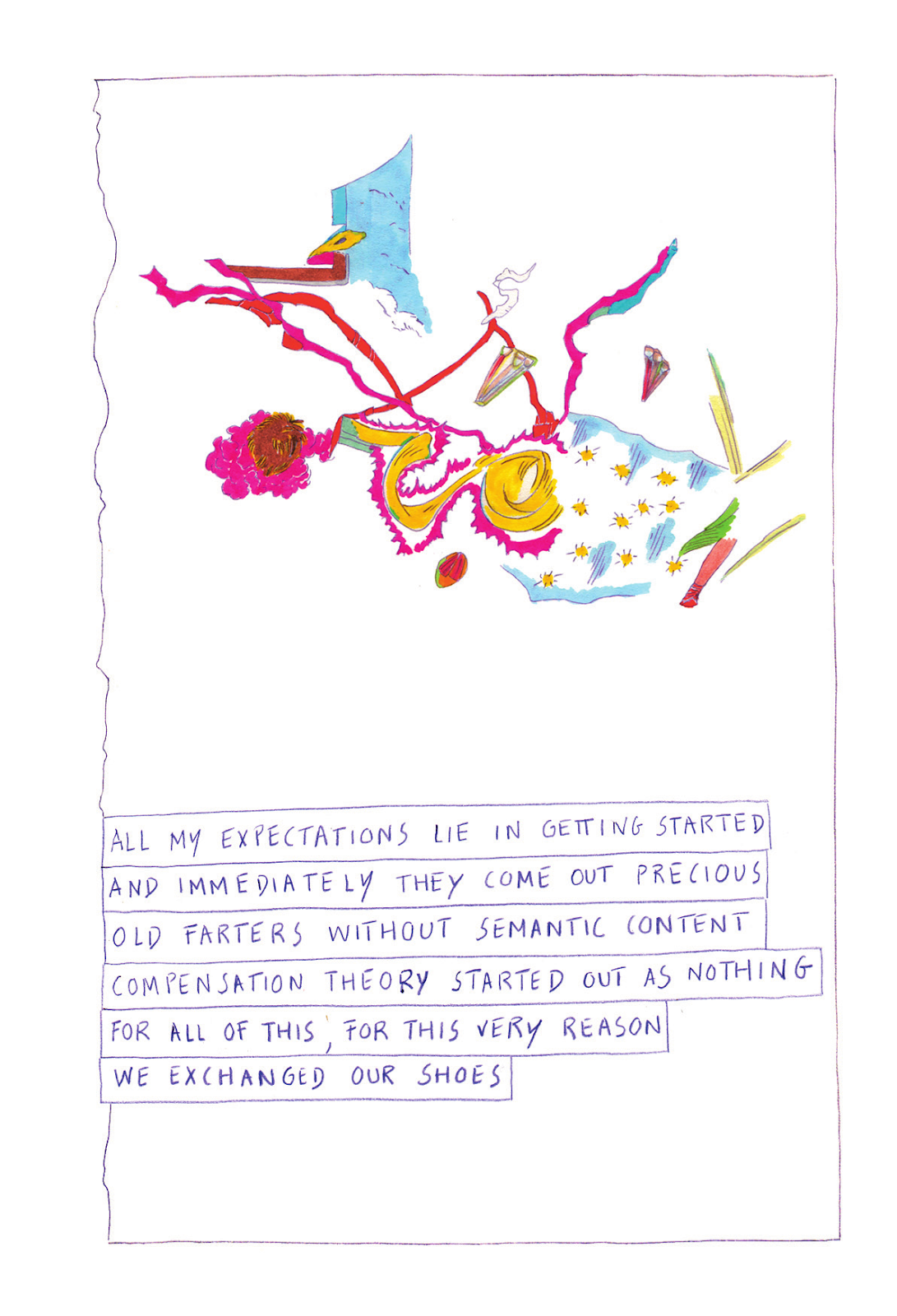
Like any good anthology, š! #26 gets off to a strong start with the first page of Maija Kurseva’s aptly-titled “Manifest” reading “THERE IS NO ULTIMATE TRUTH” as its header. Dadaists don’t have a monopoly on this, of course (American Pragmatists are fond of saying that there’s no capital ’T’ truth; one Pragmatist even makes an appearance in this book), but it’s a shot across the bow in terms of tone and stated aim.  Kurseva sets off representational sparks in the reader, allows them to fizzle before they spin into a narrative, and repeats. There is a unity of purpose and tone, and the reader is left wondering… “how?”
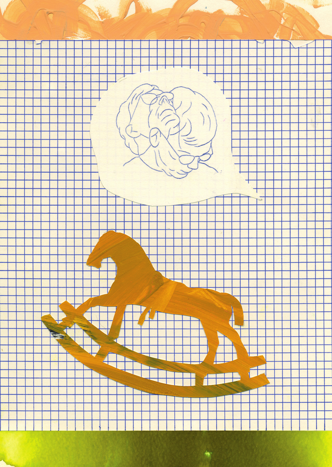
Kurseva’s comic is a beautiful, sometimes wordless ode to the best of what you can achieve with abstract juxtaposition in the comics form. A man nods in a speech bubble above the image of a rocking horse. A figure uses calipers to precisely measure one of several amorphous blobs. These not-narrative elements are hammered home because they are collaged. The fact that the elements on the page each have their own visible feel--that they each have prominent, raised, physical presence on the page--makes the juxtaposition of the elements feel tangible. These pages have subjects, and yet we as readers watch Kurseva’s pages diverge conceptually, failing to elicit meanings in the juxtapositions, even as those juxtapositions weigh heavier on each page.

Despite dada’s protest, Kurseva’s work is consistent with how I think we can understand the most challenging work being done today: it boils down to ambience. The best stuff coming out of small press publishers to the latest work of Jillian Tamaki takes our sense of a narrative woven from images and stretches out our semiotic faculty. We are forced to try and embrace--literally, hug together--a syntax hanging sporadically, leagues apart, between the images and words. In this space, via this space, meaning is augmented, warped, and thus composed in a way only comics can manage. Movies come close with their superior ability to stretch out the juxtaposition of images, but only comics let you go at your own pace and put it all on simmer, while somehow still feeling pulled to that next page turn.


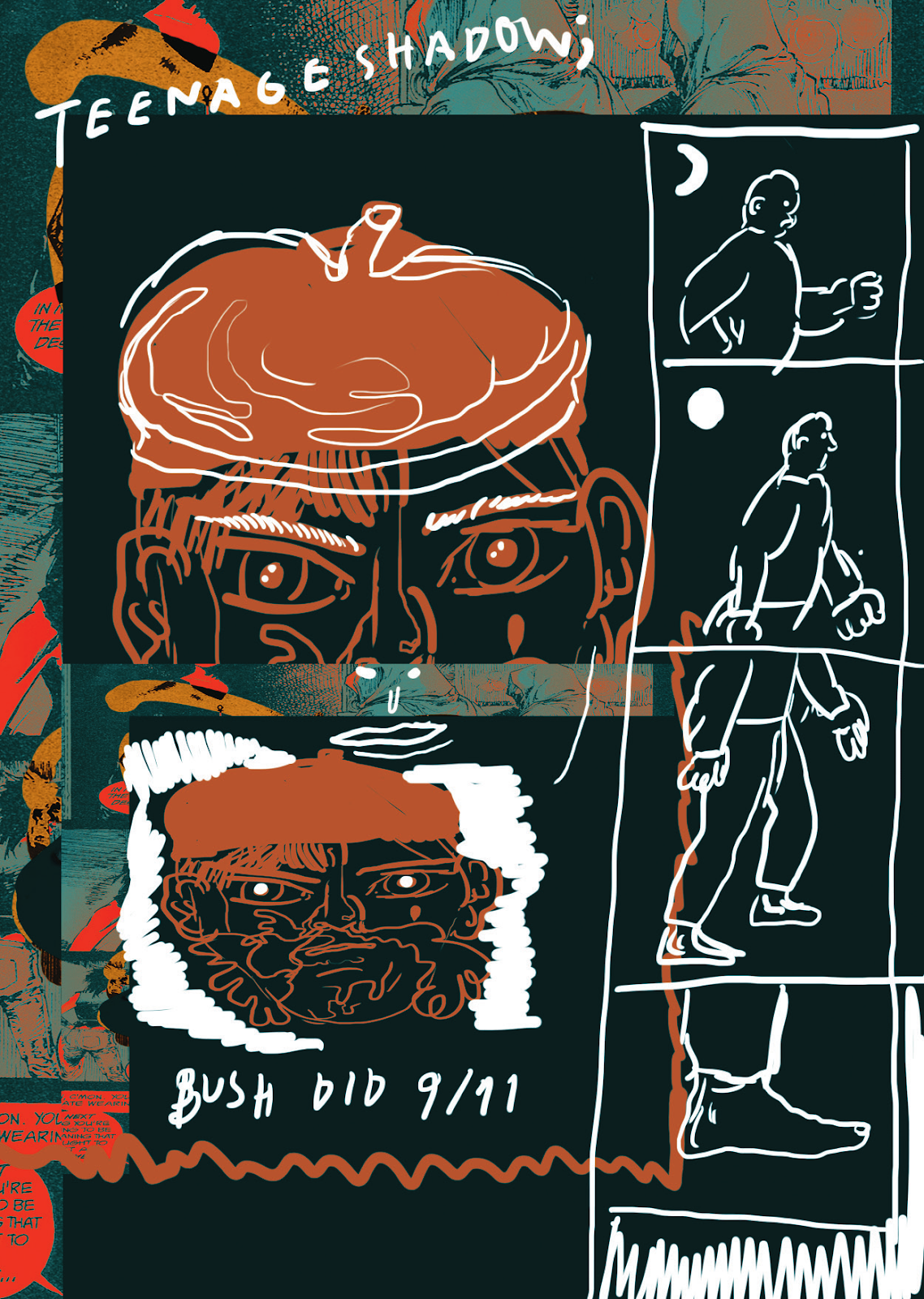
Jaakko Pallasvuo’s contribution to š! #26 inspires much more alarming, visceral reactions than his peers. As you navigate the pages of “Fables and Reflections”, it is immediately apparent how the goal of each page is to make you comfortable or uncomfortable in a distinct way, only to wrest that feeling from your mind’s grasp one page later. He starts by inverting the colors of an existing comic that he did not draw, and then stripping out everything but the black and white tones. Over this he mixes freehand drawing and uncomfortable flower collaging that varies in opacity. Other than when the borrowed comic later returns, the story is a mess of random prose and panels strewn about. Any time he deploys any of these features, he immediately switches gears, not allowing even comfort in modes of discomfort.

Pallasvuo's work here is a good approximation of the anthology itself: at its best, it confounds in ways inherent to the medium, turning juxtaposition in on itself and adding layers where it seems like there should not be any; at its worst, it throws shit at a wall to see what sticks... and not much does. While it makes sense for a dada comic not to run too far with any given structure, each page of this comic feels like it’s from a different planet, and after a few pages, I don’t know why I’m making the trip anymore.

How can we find value in the medium if not through narrative? I can think of several ways, and so can this anthology, which fluctuates wildly in its response to the question. Sometimes, the answer is straight-up eyeballing the medium itself.
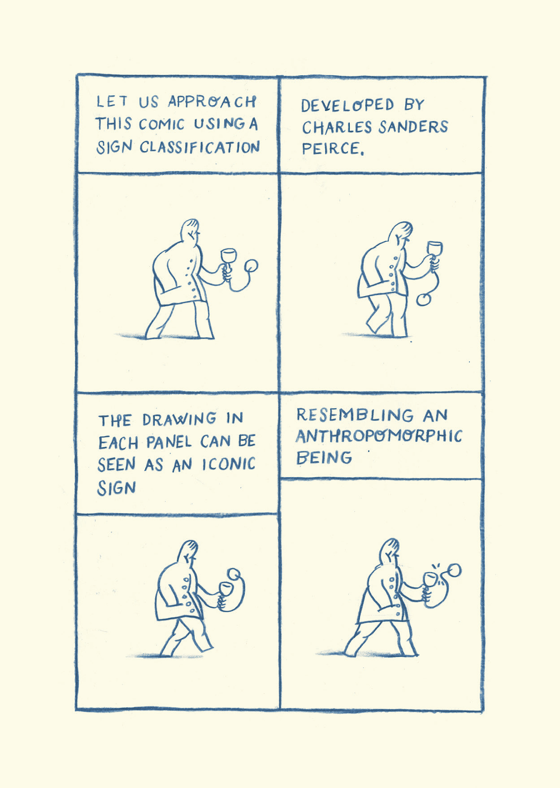
Martins Zutis does this in "Cup and Ball" when he more-or-less carries out a comic in which he describes the comic itself as the comic goes. Zutis leans into a slightly more technical impression of Scott McCloud as he explains the way in which each individual comic panel evinces meaning as an iconic sign.  The more this one sat with me, the more impressed I was: Zutis drives a narrative with a description of the narrative itself. After talking about things that do not resemble that which they represent (like words), he explains how he sees a few of his drawings as embodying a particular metaphor, which is itself the abstract embodiment of meaning through resemblance. None of his observations about the form are novel or earth-shattering, but, like his line, his execution is delicate, making for a subtle meditation on the form composed with the form itself.
Other times, š! #26 answers the challenge of building substantial comics without narrative by scaffolding pages with colors and lines, but not together: each page alternates meat and bones.  Dunja Jankovic's "A Conversation Between Black and White" is an infuriating distillation of all of the basic visual elements of comics. Here contrast is literal: one page has color, another has black and white, and only black and white. Lines come together to form shapes on one page, and then run exclusively against each other in specific directions on the next. As a reader, it's worth trying to figure out what's being asked of me when I'm faced with this kind of work. I am more likely to believe that this is a series of consecutive illustrations than a comic. While that says almost as much about me as it does about the work, if you ask someone in enough ways "what is the point of this?" eventually you will hear, "I don't know."

Imagine stringing a series of Rothkos together and being told it was a comic. Surely it isn't true just because somebody says so, but think about what the experience would be like if you knew very little about Rothko's work. That which can be impactful standing on its own is asked to carry a different semiotic burden when placed next to other images intentionally, as part of a whole greater than itself. What, then, are we as readers to make of a work that exists to undercut itself? How can it extend or inform our experience of the world if all of its energy is focused inward, with its syntax collapsing like a dying star?
Still yet other times, š! #26's answer to value is to embrace narrative, albeit it in ways that acknowledge that the narrative itself is not inherently useful. The very idea that "good" comics stand opposed to the more confounding ones by virtue of having tidy narratives is directly challenged by work's like Burkholder's "Meet Da Blee" which hinges on one single gag and beats both the reader and Blee himself to death with it. Fritz's "An Alert and Knowledgeable Citizenry" has a rhythm to it and a singularity to its imagery that is hard not to enjoy. Sammy Stein’s “End of Dada” presents its narrative objects in such a sterile fashion as to appear like it belongs in an inflight instruction manual, synthesizing elements of nature and artifice, yet making both feel foreign.
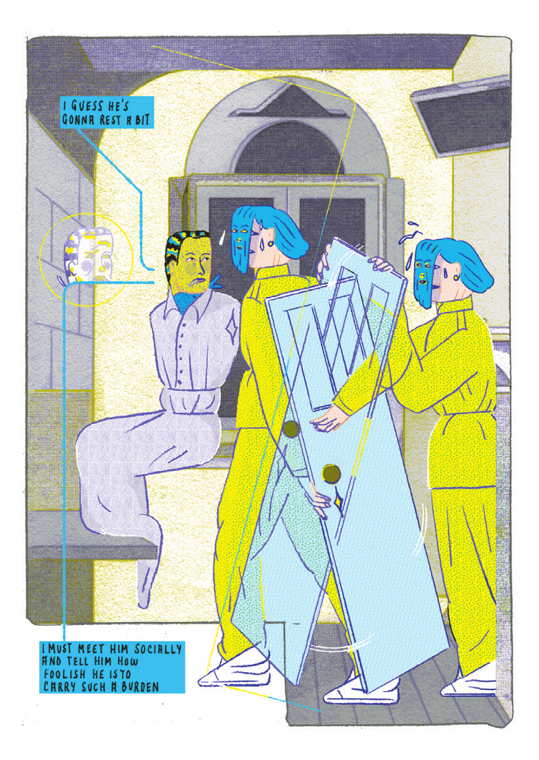
Daniel Lima scratches our itch for narrative by experimenting with time by using space, all driven heavily by a strong color identity and striking design. What’s notable about “What is a Door, Properly Speaking?” is that, in terms of dialogue, it is a word-for-word remake of this Krazy Kat strip. Lima took this already surrealistic scene in which Krazy ponders why door mouse carries a door around and injected surrealism into the very fiber of a comic’s structure.  In the original strip, backgrounds constantly change, and yet Lima heightens the visual surrealism by carrying out this cubist waltz in a single confined space in which only objects in the foreground move, and almost always in unexpected ways.

It is hard to capture the breadth of ways in which this particular edition of š! chose to challenge readers. While individual comics shine, the nature of all of this work qua Dada is meant to be oil to the water that is a cohesive reading experience. The emulsification of the work largely depends on the reader’s patience and willingness to come at the anthology from an angle that works for them. Initially, I felt like I was fighting pretty hard just to get some semblance of a holistic take on the book. It was only on my third or fourth time through that I started to appreciate a scattering of choices made by specific artists, and those choices helped illuminate more obtuse work throughout the book.

Eventually, I realized that this is actually how I read all anthologies, and not just the ones where a stack of milk cartons in a giant tube sock is getting laid. Where I originally took the question at the core of this book to be, “how can we find value in comics without narrative?” a more true-to-dada question that readers will arrive at, allowing for some patience, is “how can we talk more organically about the space between what’s on the page and how we make it work in our heads?” Narrative, where it emerges in most comics, is just one way that sequences of images can connect with people. It is linguistic in a rigorous sense, which also means that it tends to be one of the least interesting ways a comic can connect with us, since it requires no effort on the reader’s part.

Of course, even when a work is driven by narrative, there is still much more going on between the work and the reader than meets the eye, if only they allow themselves the time to marinate in that space between the them and the work. Challenging work makes it easier to enter that space, but it is also quicker to frustrate readers. Pushing through that frustration doesn’t mean assenting to the excellence of all abstract art. Instead, it means the difference between merely pointing at artwork and having an intellectual and emotional dialogue with it, even if the only fucking thing it says back is “dada.”


Austin Lanari is a programmer by day and a writer by day also. He likes to sleep at night. He’s got a master’s in Philosophy and he’s gainfully employed, so shut up. You can find his writing on Comics Bulletin, Loser City, Comic Bastards, and mostly these days on his own site at . Follow him on Twitter .