Showing posts with label David Fairbanks. Show all posts

December 13, 2018

BOOKS WE LIKED 2018: Francesca Lyn, David Fairbanks, Kawai Shen, and Josh Hicks

It’s the most wonderful time of the year. That’s right -- it’s BEST OF season when comic sites large and small churn out their lists, anointing subjective BESTS and, thereby, relegating thousands upon thousands of unlisted comics to the long box of Misfit Toys.

We here at Your Chicken Enemy are uncomfortable with these implications of creating BEST OF lists. Instead, we focus on celebrating ALL that is good in small press/self-published comics. Our site is built on an appreciation for diversity, admiration of artists, respect for the craft, and, of course, sandwiches.  

So, in lieu of the traditional BEST OF list, Publisher and EiC of YCE, Daniel Elkin, has gathered his flock of (Chicken) Enemies and asked them for their contributions to Your Chicken Enemy’s inaugural
Today’s BOOKS WE LIKED 2018 features books liked by Francesca Lyn, David Fairbanks, Kawai Shen, and Josh Hicks

Make sure to check out Wednesday's Favorites from Nick HanoverSara L. JewellJason Sacks, and Mark Stack

Tuesday's Favorites from Ryan CareyPhilippe LeBlancSteve Morris, and Austin Lanari.

And Monday's Favorites from Rob CloughKim JoohaAlex Hoffman, and Keith Silva.

Francesca Lyn:
Where Do You Go At Night?
by Miranda Harmon
Self-Published
More Information HERE

Where Do You Go At Night? is a charming, self-published 28-page collection of short autobiographical comics that center on Harmon’s move to Southern California. This is a humorous and sensitive comic from a cartoonist that radiates talent. Harmon, a graduate of the Sequential Arts Workshop (SAW), is a gifted storyteller who perfectly captures the daunting and exhilarating feeling of moving to a new place. In the comic, Harmon explores her new home, going on bad dates, making new friends, and pondering what it means to grow and change. Her strong drawing skills are revealed in her thoughtful character design and the care in which she renders her environments. In addition to a dose of whimsy, Harmon’s comics have a touch of the surreal. Whether she depicts herself as a human woman or as a busy cat going grocery shopping, her ability to communicate a nuanced mood shines through. I purchased this minicomic directly from Harmon at the Small Press Expo. At the time of this review Where Do You Go At Night? is out of print but will be reprinted next year. Several of Harmon’s other comics are available through Radiator Comics.

Battle Arc 2088
by Danny Djeljosevic (writer and letters) and Brett Marcus Cook (art)
Self-Published
Available HERE

Battle Arc 2088 is a tightly plotted comic set in a Day-Glo cyberpunk future. In this 40-page comic, Djeljosevic and Cook present a cautionary tale of what we may encounter when our biology becomes inextricably linked to proprietary technology. The story follows scientist turned crusader Zell as she navigates wearing a stolen experimental super suit called the Battle Arc. The suit allows Zell to fight people who have augmented her bodies through sophisticated biohacking. While Djeljosevic and Cook have created a fascinating future world where chaos rules, their biggest strength lies in creating a compelling protagonist with genuine pathos. Zell is a refreshingly heroic character with a strong moral compass. Her sincere desire to do what is right for all of humanity drives the story and this strong characterization adds heart and poignancy to what could have been a visually appealing but more general sci-fi story. I purchased Battle Arc 2088 by supporting the comic’s Kickstarter campaign, but it's now available on Gumroad for download.

David Fairbanks:
Did You See Me?
by Sophia Foster-Dimino
Published by ShortBox
Available HERE

The idea of a definitive, whole self has always been fantasy, but in 2018 we seem more capable than ever of fracturing, of presenting only select facets to select groups of people. Who are you on Twitter? On Facebook? At work? With your partner? When you dream? Where and in what ways do our collections of personae overlap, what does it mean to know someone, and what does it mean to be honest? These are heavy, complicated ideas that Foster-Dimino seems perfectly at home with. By using different styles for the waking world and the dream world, by presenting the spaces of Twitter and television via different layouts, she establishes firm boundaries between these areas, boundaries which are perfectly subverted by the narrative. 

On its surface, Did You See Me? is just a story about a person moving from one relationship to another, but the continued juxtaposition of uniform narrative and distinct artistic style begs the reader to question their own reality. What is a real relationship? Is a person being unfaithful if they dream about (or share dreams with) someone else? What if it feels like infidelity to the dreamer? How different is that dream space from the ether between two people's computer screens? Foster-Dimino encourages this kind of questioning in the reader while being brave enough to avoid offering a clear answer, which has left me thinking about Did You See Me? since it arrived in my mailbox earlier this year.

On a Sunbeam
by Tillie Walden
Published by Avery Hill Publishing
Available HERE

Yes, I am using the print publication of On a Sunbeam to justify mentioning it the year after it was finished. No, I do not feel guilty about finding a loophole to praise one of the best cartoonists working today. Tillie Walden has a knack for distilling emotion and expression into essential, smooth lines. Her faces are simple without sacrificing any human complexity. It may sound cold to describe it as "efficient," but I think it's apt. The style of Walden's characters allows the reader to quickly and easily read the human dynamics of a scene to then absorb her narrative, her worldbuilding, or even just her backgrounds.

While The End of Summer had its Little Nemo connection, On a Sunbeam more closely walks in the steps of Winsor McCay, with Walden giving herself permission to create and explore fantastical worlds unburdened by the small chunk of history we have carved out on Earth. Her limited color palettes somehow allow the comic to pop in a way that would be impossible with a full range, and they help clearly establish tone and time. It would be a joy simply to come along for the ride as Walden draws whatever world she sees fit, but the characters she gives us feel both familiar and wholly new. The relationships of a crew of scavengers/restorationists and a cadre of boarding school students would each be enough to carry a 500-page tome like On a Sunbeam, but here we get both as Walden weaves their timelines for a story of love and humanity that is epic in scope.

Kawai Shen:
Koreangry 3
By Eunsoo Jeong
Self-Published
More Information HERE

Koreangry 3 is the third issue of the Koreangry series, a self-published comic by Eunsoo Jeong. It features a series of photographs of a plasticine-like version of the author, bug-eyed with cartoonish foam hair, a crooked tooth, and a pair of irate, bushy brows furrowed into an acute “v”. Jeong then poses her model in miniature dioramas full of the most fantastic, tiny props: beer bottles on her bedside table, a basket full of Korean spa toiletries, a pot of a dead plant in her office, its leaves scattered on the floor.

True to its title, in a mere 24 pages, Jeong delivers a torrent of expletive-laden rants on weighty topics such as sexism, racism, work precarity, and anti-immigration in the US. Jeong's depictions of herself as outlandish and unfeminine are refreshing because she is never self-deprecating and has a great sense of comedic timing. The entire series is recommended.

YOU DON'T HAVE TO BE AFRAID OF ME
By Victor Martins
Self-Published
Available HERE

Victor Martins' You Don't Have to Be Afraid of Me is a self-published, two-color riso, autobio comic. It employs a disarmingly cute cartooning style to Trojan-Horse you right into Martins' personal experiences in overcoming gender dysphoria, gendered violence, and self-harm.

Despite the comic's brevity, it manages to pack in a powerful mix of cultural critique, vulnerability, and a touch of humor. Do not be fooled by the simplicity of Martins' drawings. His economical linework is precise and his figures expressive. His use of text is also disarmingly casual, only to be deployed on one page in a memorably graphic manner to devastating effect.

All in all, it's a very personal story that reminds me how the autobio genre in comics can convey an immediacy, intimacy, and vibrancy that cannot be found in other mediums. It also shows us that there are still vibrant, fresh narratives to be found in autobio work.

Josh Hicks:
Dark Angels of Darkness
by Al Gofa
Published by Peow Studio
Available HERE
Sweden’s Peow Studio always put out beautiful comics (I reviewed their Ripples here last year) and Dark Angels of Darkness is no different. Al Gofa’s macho wasteland punching epic follows military mastermind Megan, superspy Garo and killing expert Symba in their quest to overthrow the dictatorial Imperius Rhâââ, an all-powerful being who has imposed a law making the act of fusion -- two beings combining and becoming one -- punishable by instant death. Gofa’s writing is self-aware and knowingly goofy, stopping just short of full-on parody, and the fusion-based conceit gives ample opportunity for him to bombard us with new characters (each with their own full-page pin-ups) and excuses for fight scenes. Despite the homage-heavy premise (Gofa’s admitted touchstones of video games, 90s action figures, and 80s manga are all well served) Darkness’ sense of humour, expressive brush lines and lush colouring -- all yellows, oranges, and purples -- make for a dynamic and fresh book that sits perfectly within Peow’s catalogue. The most metal comic I read this year!

Summer Break

by Lottie Pencheon
Published by ShortBox
Available HERE


Lottie Pencheon is making some of my favorite minicomics in the UK at the moment. A shift in tone from her shorter joke-driven work, Summer Break is a foray into heavier stuff, being explicitly autobiographical and dealing directly with depression, disassociation and a general, undiagnosable feeling of malaise. The book finds Lottie in the middle of a mental health crisis that she can’t begin to fathom or understand. Unsure as to whether her symptoms are indicative of larger issues or simply a vitamin B12 deficiency, she opts to continue with a planned family outing to the country -- where things only continue to get worse. The longer format allows Pencheon’s art pencils and colors really shine, and as Lottie’s mental state worsens, Pencheon’s world deteriorates with her: environments begin to fall apart, objects begin to trail, and interior discourses between two interior Lottie’s -- Summer Break’s equivalent of the classic angel and demon on the shoulder -- begin to erupt into chaos. Pencheon’s sense of humor and pure cartooning skill allow her to navigate the subject matter without veering into the self-exploitative or the twee, and it quickly becomes clear that Summer Break is a highly personal and cathartic work -- not to mention a compelling and affecting one.

Soft X-Ray/Mindhunters

by A. Degen

Published by Koyama Press
Available HERE


A. Degen is a weirdly formative figure in my comics reading and practice. His story in Snake Bomb Comix #2 was one of the first small press comics I ever read, and as a result, I feel almost genetically predisposed to like anything he puts out. Like much of his previous work, Soft X-Ray/Mindhunters is wordless, telling two stories — Mindhunters, about a pair of masked brain-based vigilantes, and Soft X-Ray, about a group of abstract god-beings — in tandem, using images alone. Degen tends to maintain an obscure bedrock of esoteric philosophical, religious and literary thought underneath what are essentially poppy and colorful sci-fi stories, and that continues here. He made his first work while living in Japan, and pop-art flavours of Tadanori Yokoo illustration, Sasaki Maki comics, and children’s live-action tokusatsu programming run throughout the book -- belying many of his more academic influences (i.e: the ones I am too stupid to ‘get’ without using google) -- while his clear line, detailed environments, and emphasis on purely visual storytelling work together to provide a lush, dense and satisfying read. In turns funny, dramatic, mysterious and incomprehensible, Soft X-Ray/Mindhunters is Degen’s most ambitious book to date and a comic that I fully recommend.

September 10, 2018

Change Too Often Comes At A Cost To Those Who Have No Debt To Be Paid: David Fairbanks reviews MARSUPIAL MATCH by Ana Hinojosa

Do you know who Ana Hinojosa is? If you're reading Your Chicken Enemy, you presumably like comics, and if you like comics, you should know who Ana Hinojosa is. While it was her Bedroom 2017-2018 prints that caught my eye at CAKE 2018, the "read me" sign stuck in an open copy of Marsupial Match brought out my wallet. I picked up the display copy and its smooth-but-not-too-smooth texture reminded how important every aspect of a minicomic can be; Marsupial Match was new, yet already it felt familiar. I slipped my thumb under the cover and opened to an inner cover of pink gridlines and a first page that tells quite the story on its own:
What you don't get in the picture above is the cartoonist herself saying "it's a story about a boy named Gustavo, raised in a family of opossum hunters, who decides he doesn't want to hunt opossums." And that's all it really took. I swiped my card, slid the bagged comic into my tote, and went about the festival. 

Marsupial Match wasn't done with me, however. 

CAKE exists in a shared space at the Center on Halsted, which has a seating area on the main floor where CAKE-goers regularly sit down, sort through their hauls, and snack on something from the adjacent Whole Foods. It's here, between bites of salad, that Marsupial Match came back out of the tote and bludgeoned me with feelings in a pretty public space. Uncomfortable with his family's ritualistic hunting and killing, Gustavo flees home and no sooner is he out the door than he meets someone who would be prey to his family: Opossum Opossum. 

Though apprehensive of each other, the two become friendly, leaving neither alone in the wilderness. A sparse, yet convincing wilderness that reminds me of Anders Nilsen, though I hesitate at what feels like an unfair comparison for Hinojosa. Nilsen's subject matter often gives his sparse style a sterility, a coldness that rarely does him any favors; his lines may wobble at times, but his pages simply feel too clean. Hinojosa's blades of grass, on the other hand, look disordered enough to be real; they complement the sparse fur and wayward whiskers of Opossum. The gargantuan leaves of her wilderness look paused mid-breeze, arranged just so, framing Opossum and Gustavo in a scene. Her disarray is a disarray with a purpose.

Hinojosa does a brilliant job of building up the relationship between her two characters, with Opossum living in this unusual space between animal and human. She gives Opossum no dialogue, yet they very clearly respond to each of Gustavo's questions. Opossum has a life that we as readers are not at all privy to, a life that includes a driver's license and at least one joyride in a convertible. 
When tragedy strikes, it comes from both characters reverting to their baser instincts, Gustavo doing so first -- and then reacting more violently -- speaks volumes about his past, about humanity. Gustavo simply pockets the photo of Opossum as if he has a claim to it, sabotaging whatever trust had been gained between these two strangers. Who could blame Opossum for biting the thief, either? Yet that has Gustavo draw a blade, and… you know, a fight between an opossum and a teenager may not sound particularly exciting. And in the hands of a lesser cartoonist, the tension may have been defused, the comic spoiled. But Hinojosa's command of pacing is praiseworthy.
Here again, Hinojosa's sparseness works to great advantage, forcing the reader to see these characters we have briefly grown attached to fall, disappear beneath the water, and then… nothing. When they eventually emerge from the water, Opossum's disheveled fur is now marred by graphite. It would be easy to have the red of the blood be the only piece of color in a comic like this, but there is something about the splotch of black lead spreading from Opossum to Gustavo's hand to his jacket, the soft dark of pencil lead migrating, transferring from skin to skin at first unnoticeably, but with a tenacity familiar to anyone who has picked up a pencil and drawn for more than ten minutes. She creates a metaphor that taps into one of the most common experiences -- the realization that your hand has picked up quite a bit of lead from a drawing you've been working on -- and then says "yes, this is what it is like to grievously wound someone you care about without realizing or meaning to, and it's just as difficult to clean up."

In 16 pages, Marsupial Match introduces us to a pair of characters, tells us just enough to get attached, and subjects the reader to the incredible range of human emotions. Hinojosa makes it easy to see something of ourselves in Gustavo, someone who wishes to be different from, perhaps better than, those who came before him. She presents the idea that a character raised in a toxic environment can change but that it's far from simple and nowhere near easy to do so, and that change too often comes at a cost to those who have no debt to be paid. 

Marsupial Match is unwilling to answer lingering questions about Gustavo and Opossum beyond "have they survived," and it's a testament to the strength of their characterization that I want to know what happens next for them, feel as though I already know, and also want to live in the ambiguity of a wounded opossum left alone in a hospital bed. I don't suspect there will ever be another story with these characters, as Hinojosa deftly recreates the feeling of a person entering and leaving your life, uncertain of whether they will ever return.
You can find Ana Hinojosa online at www.anahin.com.

------------------------------------------------------------------------------------
David Fairbanks is an artist, poet, and critic who makes a living doing none of those things. David's work has appeared at Loser City, Comics Bulletin, FreezeRay, DayOne, and now Your Chicken Enemy. His handle is bairfanx basically everywhere, and you can learn more at his charming yet infrequently updated website: davidjfairbanks.com.

April 16, 2018

It's What You Leave Out: David Fairbanks on The Poetry of Absence in CHANGE by Ales Kot, Morgan Jeske, and Sloane Leong

Flip open a comic to a random page. Perhaps the first thing you notice are the seas of color or blackness greeting you. Perhaps something incredibly dynamic is happening and your eye is drawn to the "motion" of a punch through visual cues. Perhaps a character is giving a lengthy speech that leaves the page dominated by word balloons. The visual nature of the medium leads to a focus on those visual elements, but the majority of comics function rely on an absence, an anti-visual element of the page: the gutter. 

As comics have mostly moved away from a more rigid formalism, they have begun to walk the path of free verse poetry by making incredible and innovative use of panel placement and the breaks between panels. Ask a poet why they broke their line in a certain way and they are just as likely to say "because it felt right" as they are to offer a straight answer regarding form and sound and image and surprise. While the medium of comics and the responses of creators to questions about page composition and gutter placement is similar, there is nowhere near as lively a conversation around the insertion of absences (or the absence of absences) into a page of comics as there are the breaking of lines in a poem.

It's a conversation I would like to start. 

Discussion of page layout and panel composition most often focuses on grids -- a critic's discovery of a comic plotted mostly on a grid or a creator's announcement that their comic was put on a grid with some purpose. David Hine and Shaky Kane used a 4-panel grid for a Burroughsian cut-up experiment in Bulletproof Coffin (inspired by 4-panel grids in older Jack Kirby comics), Frank Miller used 16-panel grids in Dark Knight Returns, and Tom King seems inexplicably intent on using 9-panel grids with multiple artists on multiple comics. And critics talk about them. A little. There is a certain point at which the discussion of the grid -- much like its continued use page after page -- gets repetitive and a little boring. So I won't be talking about grids, except perhaps for the ways in which they do something innovative. 

Change (Kot, Jeske, Leong, and Brisson) was certainly not the first comic to get creative with panel placement, gutters, and page layout, but it was the first time I took notice of what panel placement and arrangement can do for the communication of the story. It was the first time I felt it, and it might be easier to start with an example. 
This page has some of the clearest examples of Change taking advantage of readers' familiarity with comics and how they are read. Occurring in the prologue, this snippet lets Morgan Jeske and Sloane Leong accomplish more in one(ish) panel than many comics do in a single page, condensing heightened emotions and tensions into a single panel instead of a series of talking heads -- and in this panel, there are two trios of inset panels emphasizing the characters' eyes and mouths as the conversation gets heated. Jeske is saying "yes, this conversation is occurring now, but also so are these facial movements," and the contrasting colors brought by Leong allow these microscopic panels to command a reader's attention. Constructing a panel this way requires a certain level of faith in the reader -- after all, there are comics readers who simply follow the word balloons from top left to bottom right and then turn the page, like listening to a TV show as your eyes are elsewhere -- but the combination of the contrasting colors and the placement in line with the word balloons makes it more likely for a reader to pick up what Jeske and Leong are putting down. 

If I were to extrapolate the idea of the gutter as comics' line break further, that would leave a page as an equivalent to a stanza. What, then, is going on with those inset panels? They have clearly defined panel borders with space between them, but they are laid on top of other, relevant art. They are taking the advantages of breaking a panel -- creating discrete ideas/emotions and presenting them to the reader -- without the formless void that exists in the typical gutter. It's an example of having your cake and eating it too, and it is a technique that poets like Mica Woods and Chrissy Martin do incredibly well. 

In the third of Mica Woods' "Three Poems from Now/Here," she incorporates the forward slash (typically used for marking line breaks in poetry transcribed as prose) to break the line without really breaking it: 
suspicion on the train from one stop / to the next an American train / on a German train once / the woman across from me and B thought we were German / until we told her we weren’t / this was perhaps flattery / to no end except kindness in a version of a haunted house centipede / the great / murder mysteries and robberies should happen on trains not in mansions / nor banks / the path is inevitable / unless it hits a cow or car and these things are usually considered / replaceable parts / so all plots are resting / places everyone can catch their breath / in the arc as it appro/aches infinity, which is always (a) suspect for this reason / you’ll need / a good feast of an intermission to gut out the suspense within an unstoppable train / we know / where it’s going / five bodies will be on the floor and at least four / will not get up into the shuddering air of humanity again 
This creates the effect of a boundary without fully separating the text from the rest of its line. It encourages a reader to hold multiple ideas in their head at once, in much the same way that the inset panels in the panel of Change. One could make the argument that word balloons work similarly to this application of panels within panels, but there are unfortunately few examples of word balloons with distinctly non-textual elements in them. 

Chrissy Martin's poem "Flexible," on the other hand, encourages the holding of potentially conflicting ideas, leading a reader where she wants them to go while massaging that reader's lexicon in a way that might give them a bit of empathy toward women and a better understanding of the expectations placed upon them: 
We are girls scrawling words across collarbones, my body is instrumental no no not ornamental / how then so many hands decide to pluck pluck / decide to perform their favorite songs / high notes on the tightness of our thighs / lows in the resonance of empty bellies / girls that are playable / pliable / malleable / see flexible / see supple / see stars from hunger / i.e. thin / i.e. desirable / girls someplace between mace and home / carrying catchphrases, 
The conflict brought up by Jeske and Leong on the third page of Change is more visual than conceptual, for while the inset panels clearly work in concert with the dialogue and facial expressions in the main panel, it's the color contrast that makes the panel work as a whole. 

There are three other techniques on display in this image alone: panels overlapping each other and spilling out into the gutter, a panel that has been sliced into discrete chunks to effectively slow the transition to the next panel, and a consistently inconsistent panel size that dispels notions of uniformity throughout the entire work. 

Let’s bring that image back again to focus on something a little different: panels that either spill out into the gutter or overlap other panels. Panels overlapping panels creates the sort of simultaneity I’ve already discussed -- it’s what allows a reader to hold those transforming emotions in mind while also experiencing the static image on the page. When they overlap with each other, however, those smaller panels create something of an order of operations that suggests a reader should move down the stack to the next overlapped panel, refusing to allow a reader’s brain to fill in the gap. What is arguably more interesting, however, is when the overlapping panel spills into a gutter and does the comics equivalent of a long line (Scott McCloud might argue the comics equivalent of the long line is the infinite canvas. He is wrong). The work of Walt Whitman is perhaps best defined by the long line, represented on the page like so:
When I heard the learn’d astronomer, 
When the proofs, the figures, were ranged in columns before me, 

When I was shown the charts and diagrams, to add, divide, 

     and measure them, 

When I sitting heard the astronomer where he lectured with 

     much applause in the lecture-room, 

How soon unaccountable I became tired and sick, 

Till rising and gliding out I wander’d off by myself, 

In the mystical moist night-air, and from time to time, 

Look’d up in perfect silence at the stars.
 
Those indentations allow poets to both utilize the line break and demand a reader’s attention for longer than the page’s apparent limitations. Comics can certainly do this with panel size alone, elongating it to the edge of the page, but the problem then becomes the opposite of increased attention: readers often spend more time when they have more panels, and less time when there are fewer panels to read. The solution, then, is to slap a panel over or under your current panel to take advantage of the break in image without being forced to place a gutter between them. 

There is, of course, another way: 
Both in the original example and here, Change takes an image and slices it into panels of varying widths (and, if you’ll notice, slightly varying heights as well), requesting the reader to slow themselves as they move left to right, panel to panel. This might be one of the most common artistic techniques found in comics, and it calls to mind poets who utilize the short line and/or frequent line breaks to feed the reader in such small bites as to finish and not realize they’ve been eating a person from the toes up: 
Buffalo Bill ’s 
defunct 

          who used to 

          ride a watersmooth-silver 

                                                         stallion 

and break onetwothreefourfive pigeonsjustlikethat 

                                                                                          Jesus 

he was a handsome man 

                                              and what i want to know is 

how do you like your blue-eyed boy 

Mister Death
 
We could talk about the placement of words on the page, here -- you almost always can with e e cummings -- but for now simply look at what the reader is being fed and where it ends up. In comics, there is rarely so grand a reveal as to call it a volta, but the realm of digital comics and guided view could change that. Imagine seeing those slices of eye above, piece by piece, until your comics viewer zoomed out to show the full panel. Either way, slicing an image takes advantage of the pacing, elongating a reader’s experience with the panel while actually removing parts of the whole image. 

I’ve examined only half a page, but I think it’s clear something is going on that bridges the gap between two seemingly disparate media. While not unique to Change, this was a comic helmed primarily by relative newcomers to mainstream comics who likely held less rigid ideas of what a comic is and how it is made, who have interests outside the medium as well as within it. Here is one more example of Change doing something interesting with its panel progression and page layout: 
Though not necessarily a chaotic arrangement, Kot/Jeske/Leong offer up a different way to look at a fight, perhaps a more honest one than the finely choreographed conflicts Michel Fiffe discusses on his blog or that some comics legends are known for (see that grid there, too?). The arrangement you see above contains sixteen panels with a loose indication of how one might read them after the large one on the left. It’s glimpses and flashes, and the result is eventually revealed to the reader, But the process? Well, it’s a mess, and it should be. 

Though people will discuss time “slowing down” in a chaotic or fearful moment, this occurs from the activity of the amygdala and its laying down of extra memories to be recalled alongside those the brain might normally preserve. Change puts to page what one would experience in that fight instead of what an onlooker may see, mimicking through image and arrangement. There are ways for poets to create similar effects, but few seem as skilled at transitioning from order to disorder and back to order as Douglas Kearney
No two poets are the same, and yet the most common desire I’ve heard from friends and teachers, professional poets and amateurs, is one to be understood beyond the limits of language through the use of language alone. You could argue that Kearney’s poem uses something more than language as it turns into a lexical soup, but I don’t. It all bleeds together, and you can stare until you’re convinced it makes sense, but know that this is a lie your brain tells you so you can move on and finish the thing you were reading and get on with your damn life. 

To recreate an emotion or experience for a human being through their interaction with a piece of work…? I can think of no better way to describe “art,” and I believe all of the areas where Change overlaps with these poetic ideas are just that. There is a philosophical belief that the whole is greater than the sum of its parts, but that is a mistranslation of Kurt Koffka that has stuck around for some time due to people’s inability to break down and comprehend overly complex ideas and the incorrect assumption that an absence lacks sufficient thingness to be summed up. Koffka’s original intention -- that the whole is other than the sum of its parts -- might more accurately account for this creative dark matter. 

In comics, in poetry, what we put in matters -- and sometimes a nothingness is put in. Put simply, what is left out can contribute as much if not more than what is included. These are the absences that allow a reader to fill in and become a part of the work, for it to transform them and them to transform it. They are perhaps the key to the persistence of these mostly niche mediums. 
---------------------------------------- 
David Fairbanks is an artist, poet, and critic who makes a living doing none of those things. David's work has appeared at Loser City, Comics Bulletin, FreezeRay, DayOne, and now Your Chicken Enemy. His handle is bairfanx basically everywhere, and you can learn more at his charming yet infrequently updated website: davidjfairbanks.com.

July 2, 2016

Tiny Pages Made of Ashes -- July 1, 2016

As part of my new role as small press editor for Comics Bulletin, I've revived the dormant Tiny Pages Made of Ashes column -- reviews of small press books.


It features 3 reviews written by David Fairbanks and me:

HELLBOUND LIFESTYLE by Alabaster Pizzo and Kaeleigh Forsyth (published by Retrofit Comics)

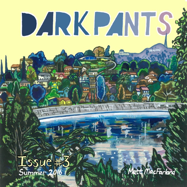
DARK PANTS #3 by Matt MacFarland

HANDBOOK by Kevin Budnik


September 18, 2015

One House, Many Rooms: Derek Van Gieson's EEL MANSIONS


I'm on a plane headed to Bethesda for SPX right now, but that won't stop me from plugging my new book!

And when I say "my", I really mean Keith Silva, David Fairbanks, Taylor Lilley, Justin Giampaoli, and mine.

ONE HOUSE, MANY ROOMS is a critical discussion of Eel Mansions, containing new essays, an "interview" with Van Gieson, and other assorted gimcracks and gewgaws. 

PLUS, it features an original cover by Derek Van Gieson! 

January 30, 2015

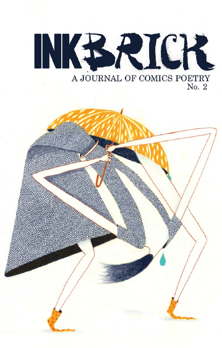
Between the Panels there is Light and there is Music: A Review of INK BRICK No. 2

INK BRICK is an anthology of comics poetry
Ink Brick 2 coverDANIEL ELKIN: The English poet Percy Bysshe Shelley defined poetry as “a mirror which makes beautiful that which is distorted.” Later, T. S. Eliot said of the genre, “Poetry is not a turning loose of emotion, but an escape from emotion; it is not the expression of personality, but an escape from personality. But, of course, only those who have personality and emotions know what it means to want to escape from
these things.”
Thinking this through, this may say more about Eliot than it does about poetry.
Anyway…
My favorite definition of poetry comes from Carl Sandburg who said, “Poetry is a plan for a slit in the face of a bronze fountain goat and the path of fresh drinking water.” That Sandburg was my kind of fella.
Regardless of the definition you prefer, one thing for sure is that poetry ain’t comics. But comics… well they can be poetry?
“Comics Poetry” is a term that has only recently entered my lexicon. Here, individually, are two words that hold special meaning to my heart, but usually they dance on opposite sides of the room in my head-disco, listening to their own particular versions of Love to Love You, Baby. By combining them into one entity, the juxtaposition of the two words is jarring. Comics, after all, are dependent on narrative, while poetry is often of the moment. It threw me a bit to think of how the two media might intersect.
Now here, standing in the midde of that intersection is INK BRICK, wearing a duct-tape coat and holding a tattered cardboard sign which may have once read “Will Yea To Your Beauty”. INK BRICK is a journal of comics poetry that is “dedicated to finding and promoting work that crosses the borders between comics and poetry – material that is either in direct conversation with traditional poetry, or that is forging a new, visual poetics.”
Goodness me, that sounds like a vaguely grandiose and unfortunately dirge-like statement of artistic intent bombast, doesn’t it? Hackles up, one could see how easily “Comics Poetry” could suffer much of the same abuse that “Performance Art” does, by both practitioner and critic.
Picture, if you will, a throng punctuated with endless beards, the sudden shine-flickers off the lenses of cat-eye glasses, and so many fine shoes snapping wildly from panel to panel as the pages turn to the beat of an extended Art Blakey drum solo. Envision swirls of colors placed JUST SO as to implore that you feel that feel that I feel when I use these colors, man, while thick set type-faces shout out “Gossamer” and “Flux” and “Ash-pits” and “Oxides” as if you should know, as if you don’t know.
Ink Brick steps
This is my “Comics Poetry” nightmare, the deviantart.com of the “latest thing” to flop out of some zipped up culture whore, pander-handed and snide-sneered from that plastic ledge of discernment — where art turns fashion turns quickly into a new app for your I-Phone 7 and then is cast aside the moment something new and shiny is shat.
Nightmares fester deep into the night. But, as always, there is a pinprick of light in that darkness. That light is INK BRICK.
Thankfully, there’s a true sense of careful curatorship in the pages of INK BRICK. The Editorial cadre of Alexander Rothman, Paul K. Tunis, Alexey Sokolin, Bianca Stone, and Gary Sullivan have dug the necessary trenches and built the solid battlements in what is assuradly a war against the thick frivolous good intent/bad execution that must constantly be seiging the Comics Poetry crowd. INK BRICK works because of this stewardship and the journal sits comfortably on the table. It is a journal that is as solid a collection of transformative art as there can be.

May 29, 2014

Review -- Derek Van Gieson's EEL MANSIONS #5

Eel Mansions #5 

Hush, hush. Voices Carry


Elkin:4.5 stars
Silva:4.5 starsFace-Time-with-John-McEnroes
Fairbanks:4.5 starsmoomins

From the Concierge: Having conquered Britannia in their review of Eel Mansions #4, Mssrs. Elkin and Silva have been informed that their crusty brand of effusive braying was beginning to rub the youth of today as poppycock and the gibbering of toothless old fools who still clung tightly to their convictions that musicians like Barbara McNair, R. Dean Taylor, and The Hit Pack inform contemporary music. Hoping to skew younger, the editorial staff at ComicsBulletin.com thought that they should bring into the critical fold the non-crusty perspective and youthful vigor of young David Fairbanks.
In a somewhat desperate and certainly embarrassing desire to appear hip and relatable, Silva and Elkin celebrate the addition of Fairbanks and have found themselves infused with the energy of youth. The editorial staff at ComicsBulletin.com have since explained to them that, at their age, the liberal use of the phrase, ''Dang, son'' and bandying about words like 'jacked' and 'wanksta' was both ridiculous and pathetic and would subsequently be edited out of any final copy. To this end, Silva and Elkin have agreed to comport themselves in accordance to their age, provided it be well established that neither of them is a coffee table.
Daniel Elkin: So, gentlemen, we have before us the penultimate issue of Derek Van Gieson's Eel Mansions and issue 5 reads much like the love child of Willy Loman's sad reveries of happier times and David Foster Wallace's footnotes to his ''Dear John'' letter. Things move fast and frenetically in this book, pushing toward an ending with increasing velocity while Tokyo Drifting into new areas of madness drowned in the soundtrack to a “supernatural kind of noir kind of thing”.
You could dance to it if you could just keep the beat. Give it a try:

Eel Mansions #5 looks to wrap up through moving the narrative forward while gazing ponderously behind. This is the first issue without Armistead Fowler, while having Fowler's backstory be the centerpiece of everything that is going on. Hmph. Still. When will the sub-plots be revealed to be functioning in tandem? Van Gieson is keeping everything up his sleeves, but they are poking out teasingly from beneath that plaid smoking jacket he so fashionably is styling. He's been looking good so far sporting that thing, but has he been wearing it so long it's now torn and frayed and seen much better days?
No. Eel Mansions is still dernier cri and by golly if Van Gieson ain't still his own kind of Lizard King.
To whit: Janet Planet has set her ''way out'' in motion, Bert and Chee Chee (sort of) are that much closer to their confrontation with Armistead, Record Store Guys continue to ''do their thing,'' the Negative Orphans are still pondering ''life's deep questions'' and 'Doomin' gets more abstract while 'Tales of Abstraction House' gets more non-sequitur (if possible). And then there's even more 'Milk City,' where the grass is green and the seagulls regret ''yesterday's late night drunken quest for burritos.''
We're set up for closure here, boys, but it's closure on Van Gieson's terms. As Janet Planet says, ''Everything's all commercial (sic) now. They're squeezing the Golden Goose. Now we're gonna squeeze back.'' Because this is love, brothers, love for the artistic intent.