Showing posts with label Fred McNamara. Show all posts

July 3, 2019

Taking Maturity Into Your Own Hands: Fred McNamara Reviews VISITING by Alivia Horsley

The sparse nature of Alivia Horsley’s Visiting lies somewhere between relaxed and tense. The laid-back and seemingly inconsequential holiday of the protagonist, Dylan, who is visiting his grandparents, is riddled with a soft sense of unease as he continuously avoids having to ask them an important question dictated by his mother. Visiting touches upon themes of domestic unrest and of families making decisions on behalf of others in an attempt to better them, Horsley channels these complex, arresting themes through trimmed, succinct visuals and story-telling. However, that trimmed style serves as Visting’s weakest flaw. Such is the delicacy in Horsley’s execution of the comic’s story, it’s constantly in danger of buckling under the weight of its dense themes.

Visiting’s visuals lend weight to its subtle emotions. Horsley gives Visiting a sparse appearance, using thinly drawn details and panels, sometimes eschewing panels completely. This open space allows for reflective, meditative moods to sink in. Often, the characters themselves are the only things filling up the page space, their wordless expressions emitting the beats of the story. It’s often a quiet comic, with many pages featuring minimal or no dialogue. One wonders if Visiting would be a more robust read if there was greater detailing to the characters themselves since their body language and facial expressions become almost the sole method of carrying the narrative. 
Still, Horsley manages to give Visiting a cohesiveness by enhancing everything with the same minimal detail, but given the comic’s mature emotions, they’re left suspended in mid-air in the comic’s open space thanks to the faintly-sketched characters. Horsley injects just the right amount of detail into the characters to carry the story along, but the general sparseness adds to the overall tension scattered throughout the comic. Dialogue and emotions aren’t masked in any form, they’re left out in the open for all to see. If there was less empty space throughout the comic, those emotions might have registered with a leaner and more immediate impact.

The flipside of all of this is that Visiting’s charming appearance allows its straight-faced ideas to be wrapped in a sweetly digestible casing. While Horsley's artwork is limiting, it gives Visiting an intimate, urban charm. Equally charming is Dylan himself, whose struggles make him a character easy to empathize with. He’s caught in a pointless crossfire between two clashing generational perspectives. His grandparents are content to live out their twilight years as leisurely as possible, reflecting their elderly state. 
Conversely, his mother radiates a different attitude. Despite not making a single appearance in the comic itself, Horsley effortlessly crafts a distinct personality from the mother via the barrage of harassing texts she sends to Dylan. Horsley paints Dylan’s mother as someone seemingly with the world on her shoulders, forced to care for both her son and her own parents. It’s a testament to Horsley's narrative skills how she’s able to craft this persona for the mother solely through text messages. The unnecessary burden the mother places upon her son feel like a natural extension of her world-weariness, whilst the self-inflicted drawing-out of Dylan’s aversion in asking his grandparents to move in with himself and his mother is heartfelt. 

Horsley is slight in depicting Dylan’s moods throughout the comic. Though they are skeletal, they work. Whether it’s an upturned eyebrow, a bead of sweat, or a wrinkled frown, she effortlessly conjures forth Dylan’s conflicting emotions. He’s the most fully realized character of the comic. His unseen yet ever-texting mother and his relaxed, oblivious grandparents are miles apart from each other in their fleshed-out state compared to Dylan, yet their characteristics serve the story well.

Dylan’s own miniature arc in taking the decision about his grandparent’s potential move into his own hands is another element of Visiting that bears its warm, well-paced flow. His eventual choice in deciding how to handle the situation results in him being fashioned into a link between his mother and grandparents, while also elevating his maturity. This is where the mostly sparse narrative is at its strongest, as Dylan sees how happy his grandparents are with their current lifestyle. His desire to not disrupt their happiness cements his own maturity and resilience against his otherwise stern mother. Even with that resilience in mind, it balances out the equilibrium within the family itself. Dylan’s act of selflessness relieves some of his mother’s self-inflicted burden, resulting in Horsley writing a happy ending for all concerned, not just the grandparents.
Horsley creates a natural of growth to Dylan that locks in the emotional weight of the comic. She clearly makes no secret about investing the most into Dylan, and the care and attention she applies to the character are heartwarming to see. He’s clearly the youngest character in the story, and ultimately makes the most mature and sensible decision in improving his extended family’s welfare. 

Likewise, the story itself has a pleasant flow about it. The aforementioned sparseness may make the character’s emotions float rather than hit home, yet, at the same time, it gives the story room to stretch and stroll along at its unhurried pace. This is one of the comic’s greater strengths, as nothing about Visiting feeling rushed or forced. As well, the anthropomorphism of the characters gives the story’s tone a welcome touch of light-hearted humor that adds to the overall delicate nature of the comic. That delicacy makes Visiting all the more charming to read, cushioning the comic’s taught, mature themes.

Visiting is a comic that leaves the reader wanting more, in every possible sense. It doesn’t have any problems telling its story, but it’s how the story is visually presented that makes the comic feel lacking in substance. It skeletal appearance is lacking against its mature narrative, yet the colors and shapes of its appearance remain adoringly intoxicating.

It’s innocent tone and the arc of growth for Dylan ultimately save the comic, making it a sweetly natured read that tugs at the heart. Adding to this, Horsley’s depiction of the characters as anthropomorphic animals adds a sprinkling of surface-level cuteness to an otherwise gut-wrenching situation forced upon Dylan. His actions throughout the comic make him a well-rounded protagonist to carry the comic’s story. His awkwardness around his grandparents and hesitations in answering his mother’s texts make him a naturally flawed individual, yet he eventually resolves the problem before him in a simple manner that pleases everyone. This all helps to give the story itself a clear and definite beginning, middle, and end. Visiting doesn’t have all the tools at its disposal to be the comic it wants to be, yet it makes an honest, endearing effort to be exactly what it is.
-----------------------------------------------
Fred McNamara thoroughly enjoys writing about comic books and TV shows you've never heard of. His love of indie/small press comics arose through his role as senior editor for the superhero/comic book hub A Place To Hang Your Cape. He's currently enduring a prolonged period of sleepless nights as his debut book, Spectrum is Indestructible, is gearing up for publication later this year from Chinbeard Books.

June 17, 2019

Radiating Deceptively Sweet, Innocent Vibes: Fred McNamara Reviews TWO OF US by Jessi Zabarsky

Jessi Zabarsky’s Two of Us is a deceitful comic. It’s all-ages charm masks a deeper, more emotionally entangled story of adapting to environments and mentalities outside of one’s comfort zone. On the surface, it’s a tale of a magical, ragamuffin heroine, Frebry, trying to fit into a normal school, with expectedly hilarious results. However, when taking all of the characters in Two of Us into consideration, Frebry isn’t the only character at play here who’s forced to mature in unexpected ways.

Zabarsky’s simple, direct story-telling comes with an empathetic heft that intertwines Frebry’s journey of maturity and self-discovery with a similar arc for her mother. The owner of a shop full of magical artifacts, Frebry’s mother is seemingly resplendent in wisdom and experience as she encourages Frebry to try her hand at Mundane School instead of magic school. This opening scene not only establishes the sweetly deadpan tone of Two of Us, but it also deceptively confirms the layered approach to the comic’s story. The scene depicting Frebry’s frustration at being sent to a different school may seem to focus on her, but placing her mother in the frame also positions her own mini-arc of growth in the story, as her own frustrations arise from positioning themselves within a world that’s harsher and less empathetic to them than their regular, more magical world.
Two of Us carries a central message of maturity, of how Frebry’s experiences in both regular and magical schools allow her to gain sympathy for her single, ever-working mother by magically splitting into two versions of herself. The act of multiplying feels like a reflection of Frebry’s introspection and her getting to grips with understanding herself, bolstered by having to exist in two different worlds - magical and non-magical. It’s a handsomely crafted arc for Frebry, one that doesn’t push the boundaries of believing how self-aware a child can be.

Her maturity rests on the backbone of her relationship with her mother, who provides the platform to make Frebry grow up. The comic’s title then doesn’t refer solely to the two versions of Frebry in that context, but it could also refer to Frebry and her mother. Two of Us becomes much more emotionally well-rounded when read as a story about a daughter and her mother, rather than purely a story about Frebry. 
This slick trick Zabarsky pulls in the comic gives it a genuine depth. There’s something bittersweet in how innocently prepared Frebry’s mother is in sending her daughter off into the real world when she herself has far more trouble blending in than Frebry. Where Frebry clearly doesn’t adapt to the confines of the real world, she at least forms a close friendship. Her mother fails to do even that, but only through the assistance of their daughters do Frebry and her friend’s own mother break down their prejudices against each other. In such few pages, Zabarsky delivers a deceptively deep narrative in which child and adult play off against each other’s attempts at adapting to new, uncharted, frightening worlds they’re not experienced in.

Zabarsky’s art suits the vibes of the comic to perfection. She illustrates locations and architecture with only the barest detail, yet she makes those details count. She’s more invested in portraying her characters than her landscapes, focusing on Frebry and her mother by illustrating a warm, comical sense of character from the pair of them. Frebry is an absolute riot, drawn with a shock of uncontrollable, fluffy hair to reflect her boundaryless persona and gawking anime eyes that tap into that classic, gargantuan wonder a child can have with the world. At the other end of the spectrum is her mother. Zabarsky draws her with as more slender and graceful than Frebry, there’s a joint sense of weariness and optimism in her face from raising her deliriously uncontrollable daughter. It’s wonderfully illustrated, but again, with minimalism, and yet with all the right detail. There’s not a beat missed in these characters. Zabarsky also makes use of a limited color palette that never overwhelms the comic’s compact, stripped back style.  
Everything about Two of Us is clear, concise, and hits home. It pinpoints its emotional targets with great subtlety, yet that subtlety is precise throughout. Zabarsky’s direct story-telling gives the comic clarity to be enjoyed by younger readers, but its layered, character-driven story can easily be appreciated by older readers who may be able to spot these tactics better than youngsters. 

Beyond these analyses, however, Two of Us is a warm, jovial tale of the hardships of being both young and old. It’s a brief enough story to never lose track of this, and it’s sweetly deadpan vibe matched with the thick, blocky art lends the comic a firm tone. Two of Us stands as a comical yet gentle affirmation of how persevering in unknown situations and landscapes can increase maturity without destroying individuality. Within Zabarksy’s controlled artistic platform, Frebry’s gleeful journey is a pocket-sized joy to behold.
-------------------------------------------------
Fred McNamara thoroughly enjoys writing about comic books and TV shows you've never heard of. His love of indie/small press comics arose through his role as senior editor for the superhero/comic book hub A Place To Hang Your Cape. He's currently enduring a prolonged period of sleepless nights as his debut book, Spectrum is Indestructible, is gearing up for publication later this year from Chinbeard Books.

April 29, 2019

Drowning in Youthful, Vulnerable Romance: Fred McNamara reviews HAZE by Rosie Haghighi

The pleasant, comforting glow of Haze perfectly captures its swooning, playful nature. Bolstered by her sizzling art, Rosie Haghighi crafts a romantically sumptuous tale of love caught in emotional entanglement. Haze fuses together a variety of disparate elements, ones that occasionally have difficulty talking to each other. Yet Haghighi is able to unify these elements together via a pair of intriguing protagonists, whose teasing romance gives Haze a fluid, bobbing feel.

When reading through Haze, the most apparent thing is the blending of shape and color. The romantically entwined protagonists, Wade and Finn, are two high school students with a shared passion for swimming. The comic begins and ends with scenes involving the two boys in water, either in an ocean, in a swimming pool, or a bath. Complimenting this focus on water, Haghighi’s sketchy penciling blends landscapes and atmospheres, create a pleasantly loose, liquid tone throughout the book. 
This use of water as a central theme acts as a reflection of the seemingly fluid nature of Wade and Finn’s relationship. Haze captures their relationship as not being set in stone. Instead, it’s shown as being in motion, traversing from the pair half-acknowledging their feelings for each other to, later, relinquishing the pretense of pretending and admitting their desire to become a couple. The climactic actions in the comic’s final few pages that enable the pair to be together act almost as a dam bursting, a wave of emotions pouring out.

Countering this fluidity is the comic’s panel structure. Often, the characters and their actions are condensed into compact panels which gives the otherwise free-wheeling feel of Haze a welcome sense of confinement. Panels large and small still make room for Haghighi’s swirling art, whose gorgeous, rippling nature comes into contact with everything and everyone featured in Haze, fashioning a cohesive visual voice.
Fractured love is the other chief theme of Haze, and this provides a darker, more stern alternative to the otherwise playful attitudes Finn and Wade have for each other. In contrast to Haze’s emphasis on color and shape, the dialogue in the comic is minimal and vague. Fortunately, Haghighi flexes her narrative muscles in these moments and what precious little dialogue there is does a great deal in telegraphing not only the disconnect between Wade and Finn but also their desire to reconnect. 

The actual story of the comic is equally fragmented. Haze’s narrative is less of a complete story, and more of a series of interlinked scenes, snapshots of a relationship that has withered to some extent but eventually blossoms into something more unified. The pacing feels rough, the scenes occasionally bolted on, but the payoff is well received. The aforementioned skeletal use of dialogue ends up complimenting this narrative structure well. These loosely connected scenes aren’t cluttered by clumps of dialogue and action. Haze’s brief page run reflects Haghighi’s ambition, opting to portray a relationship neither at the beginning or the end, but rather, caught in the middle.
Bonding these scattershot scenes together is Haghighi’s supremely warm artwork. The colors, chiefly composed of a red and blue palette, bear an almost nostalgic quality, the warmth exuding from the pages rise like the temperature on a hot summer’s day, inviting the reader in. There’s a great emphasis on colors as a communicator of emotion

Haghighi primarily uses reds to shade in the characters and blues to illustrate nearly everything else. The shades of red that illuminate Wade and Finn highlight their warmth for each other and the romantic tension between the pair. It’s a subtle bit of business that underscores the tenor of their relationship. Haghighi also expertly uses a colder shade of blue to indicate a series of hallucinogenic flashbacks Wade experiences throughout the comic to rosier days spent in Finn’s arms. This darker blue emphasizes the coldness Wade feels, isolated from Finn and his initial lack of confidence regarding how to amend their relationship.
The story itself buckles somewhat in Haze’s climactic scenes. Throughout the comic, Wade’s flashbacks increase in their severity, culminating in the comic’s final, action-packed scene. The decisive moment in Haze that brings the two back together comes when Wade believes he sees Finn diving into a stormy ocean during a beach party and dives in after him. Seeing Wade make a seemingly odd venture into the sea, Finn pursues him, eventually rescuing Wade from drowning. 

It’s a sweet scene that breaks down the emotional barriers the pair have created against each other earlier in the story, but it’s communicated in a jarring manner. There’s no hint given that what Wade witnesses is nothing more than a false vision. The ensuing drama that swells from the duo diving in to rescue one another is nimble and heartfelt, it’s just that Wade’s triggering of these events feels rushed and jumbled. This perhaps highlights the weaker points of Haze’s brief, scattershot structure and suggests how scenes such as these would benefit from a longer length to allow such scenes to breathe.
Still, in Haze, Wade and Finn serve as the glue that binds all of these intricate elements together. Haghighi portrays them as an empathetic, flirtatious pair, yet hardwired with youthful vulnerability. The fondness they have for each other is juxtaposed by a seemingly self-imposed distance. It’s as if their eventual succumbing to each other marks a leap of maturity for them, with Finn telling Wade to cease with the disingenuous, casual flirting and become more open, more direct, more truthful in his feelings. 

Despite some jagged narrative delivery scuppering its emotional weight, Haze is an evocative, endlessly charming affair. It’s a comic who’s appeal lies in how it shows high emotions through sharp, precise art. Story and art grow around each other with effortless care and attention to detail, and Haghighi’s depiction of a torn love that manages to rectify itself bolsters its value. Haze is an enchanting comic who’s emotionally tuned-in state makes for satisfying reading.
-----------------------------------------------------------------------------------------
Fred McNamara thoroughly enjoys writing about comic books and TV shows you've never heard of. His love of indie/small press comics arose through his role as senior editor for the superhero/comic book hub A Place To Hang Your Cape. He's currently enduring a prolonged period of sleepless nights as his debut book, Spectrum is Indestructible, is gearing up for publication later this year from Chinbeard Books.

April 22, 2019

In the Shadow of the Apocalypse: Fred McNamara reviews WE HAVE TO GO BACK by Jordan Alsaqa and Sally Cantirino

The emotional fallout of an apocalyptic event is a tried and tested formula in character-driven storytelling. The urgency of the disastrous situation flings characters into emotional turmoil, at times forcing them to come to terms with their own mortality. It’s refreshing, then, to find that Jordan Alsaqa and Sally Cantirino take the apocalyptic narrative a step further with We Have To Go Back. This is a comic who’s story is driven by an undisclosed disaster, but it’s not about the disaster at all. Such is the level of detachment We Have To Go Back has to its own propulsive event, i.e. the specifics about what exactly has happened that displaces Jo and Katie from their lonely town to the neighboring desolate woodland.

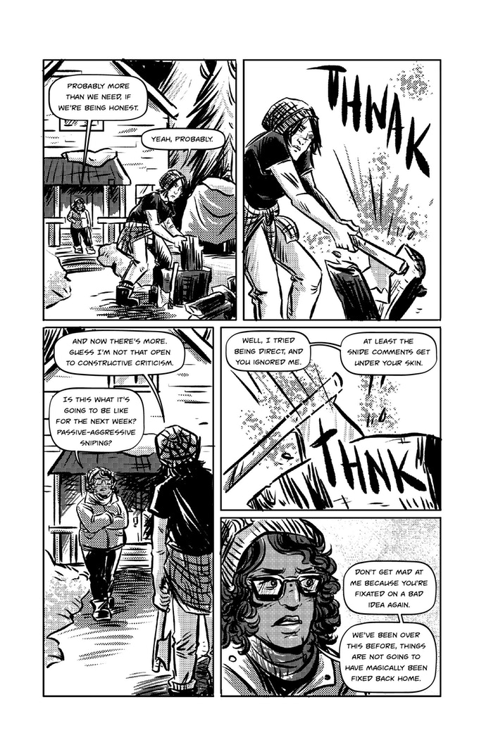
Instead, the story is about the unplugging and reconnecting of Jo and Katie’s romantic relationship. Across the comic’s brief 39 pages, Alsaqa’s story takes the reader across the ebb and flow of We Have To Go Back’s emotional current. The story is split between two points in Katie and Jo’s relationship, with the bulk of the story placed during the pair’s fractured, tumultuous time in the woodland, post-disaster. The other half of the comic takes place prior, positioning Jo and Katie’s relationship in happier times. 
The dialogue and character traits Alsaqa constructs for Jo and Katie work to form a time frame of their relationship. In the flashback segments, their relationship is just blossoming, with the pair growing used to each other’s quirks and lifestyles. In the present-day segments, on the other hand, their relationship feels aged, weary, exhausted from living their day-to-day existence. It’s as if the passage of time weighs upon their shoulders, to the point where their relationship is starting to crack. This push and pull of emotional states in Jo and Katie’s lives gives We Have To Go Back a tense rhythm. 

Cantirino’s artwork illuminates these contrasting moods effortlessly. Produced in a newsprint-esque fashion, her black-and-white linework carries the stark immediacy of the story. She captures the torn nature of Katie and Jo’s relationship by often drawing them separate from each other, either because of their bouts of sparring or separated because of the panel structure. It’s a powerful visual nod towards the damaged attitude Katie and Jo have for their relationship, how it has dissolved into an antagonistic affair, as Katie becomes fixated on returning to their desolate town while Jo wants to remain within the confines of the safety of their makeshift home.
What’s harder to pin down is the nature of the incident that triggers the breakdown of Jo and Katie’s lives. As previously mentioned, the incident itself is minimal compared to the real focus of the comic, yet is that a justifiable excuse for not giving the disaster a tangible sense of scale? Such is the skeletal amount of information presented to the reader regarding the disaster itself, so much so that it becomes awkward to try to give it a sense of its enormity. It throws the comic into a tonal limbo that’s salvaged only by that lack of information, delivering a haunting, unknown edge to the disaster.

Still, We Have To Go Back’s focus is firmly on its characters, and it never loses sight of that. Cantirino and Alsaqa fuse their skills together in the comic’s final arc when Jo finally agrees to allow Katie to return to their town in search of supplies. As Katie departs, Jo experiences an epiphany that rescues their relationship; she realizes that Katie’s encouragement for her to stray from her comfort zone has been a key factor in their relationship. This revelation is the culmination of the comic’s zig-zagging narrative construct, and Katie and Jo slip back into each other’s arms via Cantirino’s connective art, which, here, finally shows the duo closer together in the same panels. It’s a reflection of their loving nature for each other and for the rescuing of their relationship. 
It’s quite creatively satisfying to see an artist and writer work in tandem like this to ensure that the story and the characters they’re creating are delivered with as much of an emotional impact as Cantirino and Alsaqa have here. So often in the comic’s interior pages, writer, artist, letter, etc distinguish their roles as such. Yet with We Have To Go Back, the duo credit themselves as joint creators. The cohesion in the comic’s intertwined visuals and narrative is a testament to that.

We Have To Go Back is a tense, unfolding read, bolstered by intricate artwork and in-tune moods from its characters. Alsaqa’s empathetic characterization and meticulously constructed, character-driven story ensure that the reader pays heed to Katie and Jo’s clashing frames of mind. Cantirino’s art relays the subtle intensity of Katie and Jo’s situation well, but it is delicate enough to convey the more intimate moments of the story. Cantirino proves she’s equally effective in sketching out barren, open landscapes that mirror both the distance Jo and Katie have for each other and the uneasy nature of the disaster that throws the pair out of their comfort zones.
We Have To Go Back is less of a story and more of an in-depth testing of the romance between its central characters. That level of focus on the comic’s players, the unresolved nature of the apocalypse that kickstarts the story, and the minute number of characters itself require a skilled set of hands to make sure We Have To Go Back hits all the right emotional beats. Alsaqa and Cantirino, coupled with editor Danny Lore, deliver a bare, heartfelt tale of the survival of love in the shadow of a threat larger than life itself. 
-----------------------------------------------------------------------------------------
Fred McNamara thoroughly enjoys writing about comic books and TV shows you've never heard of. His love of indie/small press comics arose through his role as senior editor for the superhero/comic book hub A Place To Hang Your Cape. He's currently enduring a prolonged period of sleepless nights as his debut book, Spectrum is Indestructible, is gearing up for publication later this year from Chinbeard Books.

March 20, 2019

When Reality Slips into Fantasy: Fred McNamara reviews TAEMONS by Kim Salt

Published as part of last year’s ShortBox #9 collection, Kim Salt’s TAEMONS employs its intimate themes of self-discovery to flex the boundaries between reality and fantasy. Adding to the immediate quirkiness of the comic, Taemons’ definition of reality itself is enjoyably blurred. Taemons tells the story of a nameless woman’s journey into untangling her introversion via an app, one that quite literally pits her against her inner demons. It’s a pleasingly quirksome take on the well-tread trope of traveling to another world as a metaphor for inner reflection. 

Color is integral to Taemons’ separation of the real and the unreal. Salt depicts the true world in black-and-white, while she illuminates the fantasy world the main character is escorted to in a tense shade of orange as if to highlight the urgency of the world she’s placed into. Demons and aliens populate this world. Shape is a factor as well; Salt creates the fantasy world with a riot of curves, from the creature within to the table and chairs they sit at alike. Even the steam radiating from the tea is a billowing mass of untamed form.
Counteracting this is how Salt depicts the real world. Salt places the panels of the comic into the very architecture of the story’s landscape. Buildings and walls become snapshots of the characters’ lives, containing flashbacks to their pasts. Happy, sad, thoughtful, their lives are condensed into the very structure of their world. It’s as if the monochrome color scheme is there to reflect the drabness of the main character’s life, yet the meta-esque breakdown of paneling reads like an inner probe of her own confused mental state. The swirling state of the fantasy world becomes a much deeper probing, an active exploration of her mental state, compared to the passive, immovable structures of the real world. There’s a taut sense of confidence in the symbolic nature of Salt’s artwork. It leads to an emotionally precise read that offers a firm grip on its journey.

Elsewhere, the story Salt tells is a little more heavy-handed and less subtle than the story it shows. Taemons shows its emotions and ideas with cool, youthful clarity. However, things become sticky when it attempts to communicate those feelings verbally. The dialogue between the main character and her friend, who introduces her to the "Taemons app", feels clunky, almost heavy-handed. The reader already understands the disconnect the heroine feels via her internal monologue and the gorgeously inventive panel structures. The overall result is Taemons’ unintentional emphasis on its own inquisitive visuals acting as the comic’s strongest elements. However, the dialogue in the comic remains sincere in its confirmation of the book’s wider themes.
That sincerity spreads to the characters themselves. They’re introspective, self-aware of their own broken-down emotions. Salt’s evocative artwork may open the door, but it’s the characters that make us step through into Taemons’ world. Salt writes her characters with a touching keenness about them, how they’re not afraid to confide in each other, wanting to untangle themselves, and taking the necessary steps in doing so. Or rather, in Taemons’ case, taking the necessary sips of tea. That delicate touch of personality gives Taemons a sense of immense scale when placed next to its quirky, all-encompassing visuals.  

Taemons’ climax provides further emphasis on its eloquence by showing rather than telling. Trapped in a far-flung world and verbally toyed with by her demons, the main character initially bows down to her hosts, an added slice of sincerity on her part. However, her submissive attitude evaporates as her turmoil in this strange land continues. Knife in hand, she leaps from her position at a Mad Hatter-esque teatime and lunges for her metaphorical self. Salt illustrates this burst of confidence via a handful of evocative splash pages that place her nameless protagonist firmly in the center of focus.

This burst of confidence mellows into tenderness when the character unmasks her demons and discovers she is fighting herself. Taemons concludes with an open-ended scenario, displaying the lead’s now more rounded awareness of her own issues, while also acknowledging the long road ahead that she needs to take to overcome her difficulties. This open-ended attitude gives Taemons a sense of maturity in how it doesn’t need to provide a clean, happy ending for all concerned. Perhaps the greatest compliment one can pay Taemons is how it shows that mental health can be an unexpected journey with little end in sight. As the main character’s journey demonstrates, it can be no easy route, often fraught with chaotic bends in the road, with the destination being a better understanding of yourself. In fact, the main character’s uncovering her disguised self is the closest Taemons comes to a happy ending.
A final, subtle shade Salt gives her lead character comes in the form of a 12-panel page, with her filling in the entire page, running back towards reality. Each panel bears a separate shade of color, suggesting that all of her pieces are there, they just need filling in with a unified color. Perhaps this is a symbol of her unfinished state, how her mission of self-realization has only just begun. Or perhaps her pieces aren’t meant to be filled in at all. Is she running away from her demons, or running towards overcoming her fears? Salt’s dialogue here suggests the former. Then again, an answer more in-tune with Taemons may well be that there can never be a straightforward answer. Salt’s narration intertwines with the visuals to create something of a misleading march into the subconsciousness, landing in a place that provokes a vague atmosphere with no easy answers. 

Taemons is a thoughtful, bracing, stately introspection that delights in playing with perspective. It’s smart enough to offer no one easy interpretation of the questions it asks, leaving the reader to fill in the gaps. Salt’s strengths as an illustrator radiate throughout Taemons. The stripped-back approach to color and detail allows for a bold, eccentric structure that reflects the moods and ideas scattered throughout. Emotionally, Taemons acts like something akin to an outstretched hand, inviting you to explore our own inner demons. If your own journey is as sweetly-natured and oddly fun as Taemons, it will be worth the trip.
-------------------------------------------------------------------------------------------
Fred McNamara thoroughly enjoys writing about comic books and TV shows you've never heard of. His love of indie/small press comics arose through his role as senior editor for the superhero/comic book hub A Place To Hang Your Cape. He's currently enduring a prolonged period of sleepless nights as his debut book, Spectrum is Indestructible, is gearing up for publication later this year from Chinbeard Books.

February 13, 2019

One Thousand Images for a Single Idea: Fred McNamara reviews WHAT IS 'HOME'? by Anja Uhren

The quotation marks in the title of Anja Uhren’s comic What Is ‘Home’? serve as a gateway into its thematic exploration. The emphasis placed on the word home forces the reader to consider what exactly constitutes a ‘home’? When reading Uhren’s efforts, it’s clear that a sense of subjectivity is at the heart of the book, since part of What is ‘Home’?’s construction relies on the artist bringing onboard numerous contributors to the comic’s questioning title. This collaboration makes What is ‘Home’? a world away from her other works. Here, Uhren presents an intensely subjective piece of sequential work. The nature of the comic ensures that no answer is the same, no answer is right or wrong.

Uhren utilizes the far-reaching answers to her titular question to craft a visual journey, skipping from page to page, bringing a variety of different answers to life. What is ‘Home’? may be brief, clocking in at 35 pages, but each page packs in a world’s worth of answers via a divergent, intriguing selection of ideas and Uhren’s characteristically melancholic artwork. Nearly every page in What is ‘Home’? serves as a splash page, a canvas built to incorporate multiple sets of answers which, while separate, complement each other enough for Uhren to fashion an overall idea. While the definitions of “home” may stand apart from each other, there isn’t a sense of jarring ideologies from the comic’s participants. Uhren knows how to categorize ideas based on their tone and the image of home they conjure forth.
The result is an eloquent, intimate flow through literal and metaphorical depictions of home. Some of the answers Uhren uses are straight-forward, unflinching in their directness, while others are more abstract, more reminiscent. Throughout, though, Uhren anchors her illustrations with an exaggerated sense of shape and perspective that lends the comic a rather dream-like quality. Each image is held together by a limited color palette, which helps to cement the overall mood of that page. Uhren’s visual sensitivity is in full flow here. Lighter colors are used to reflect happier, pleasant musings on the meaning of home, while darker, pensive colors illuminate the more negative or unsure connotations.

Uhren’s use of shape and shadow, in particular, helps give What is ‘Home’? a sense of depth and scale. The architecture of Uhren’s various homes is often seen shrouded in murky shadow, as if to comfort or confine the individuals inside, depending on the accompanying definition of the term. There’s a quiet confidence in how Uhren takes these similar visual combinations and pulls forth separate moods from them. Answers and art may be working in tandem here, but moments like these show how Uhren’s craft is very much in charge.
The uncategorized pace of the comic means that, as a reader, you’re never quite sure what manner of answer you’ll be getting with each page turn, and What is ‘Home’? is all the better for it. Rather than coming across as erratic, there’s a sense of ebb and flow to the book, swaying from light to dark and back again. With such a wide variety of ideas to bring to life with her artwork, it’s a testament to Uhren’s skills as a visual storyteller that What is ‘Home’? bears a serene, almost calming sensibility.

Of course, Uhren isn’t the sole voice in this work. If anything, she’s rarely heard at all, as she allows her 50+ contributors to wax lyrical over their personal definitions of home. The variety of answers makes What is ‘Home’? read like an anthology, but Uhren’s cohesive style gives it a potent, sequential definition. Uhren herself acts as something of a curator for these thoughts and musings, as the definitions span a variety of lengths. Some consist of a single sentence, while others form numerous paragraphs, giving What is ‘Home’? an all-encompassing narrative depth.
The answers themselves boast an inquisitive sensitivity. Some define home as a literal, definitive object; a “big blue house”. Others take a more lyrical approach, linking the physical definitions of home to an emotional state: “Home means more today than it did yesterday and it’ll mean more tomorrow than it did today”. Uhren’s openness in bringing together clashing perspectives gives What is ‘Home’? a universal mood, as if every conceivable emotion tied to the idea of home is represented here. That variety of answers also ensures that the comic’s tone is kept in flux. Both positive and negative depictions of what home exactly means are scattered throughout the book, meaning that despite the comic’s overall melancholic mood, it rarely lingers on one specific feeling for too long.

Yet the text itself remains somewhat underserved by Uhren’s art. Her caricatured visuals dwarf the accompanying text, to the point where it’s occasionally impractical. The text is at its most effective when it’s ingrained into the furniture of Uhren’s panels, and when there are panels rather than splash pages. In Uhren’s splash pages, the text appears somewhat loose and untamed. On one level, that informal attitude adds to the low-key, sketchbook feel of What is ‘Home’?, but the narrative of the comic is at its most muscular when its visual structure is at work. The playful integration of the text amid Uhren’s diverse images illuminate their message, and also allows Uhren’s flexible style to unwind, adding to the exuberant intimacy of this endearing comic.
What is ‘Home’? is a spellbindingly distinct read. Its romantic qualities give even the darker moments an immersive feel. Its unique structure and gorgeous visuals fuse together into a charmingly sweet comic book. Uhren’s talents have always been well-tailored to visual narratives. Here, though, she allows her own narrative to take a step back and allow for a collaborative spectrum of ideas, musings, and poetry from which to build her comic.

What is ‘Home’? doesn’t offer a definitive answer to the question it poses, but it isn’t meant to. Rather, What is ‘Home’? shows that a word many might think to have a universally appreciated meaning has, instead, wildly diverse ones which Uhren explores to great effect. Her sublime artwork has little difficulty conjuring forth the multitude of emotions stated in the myriad of definitions. With melancholic colors and distorted shapes crafted to exquisite effect, the book’s overall message is executed with razor-sharp clarity. What is ‘Home’? stands as an enjoyably eclectic, experimental entry in Uhren’s growing back catalog of warm, hypnotic visual narratives.
-------------------------------------------------------------------------------------
Fred McNamara thoroughly enjoys writing about comic books and TV shows you've never heard of. His love of indie/small press comics arose through his role as senior editor for the superhero/comic book hub A Place To Hang Your Cape. He's currently enduring a prolonged period of sleepless nights as his debut book, Spectrum is Indestructible, is gearing up for publication later this year from Chinbeard Books.